
Suppose you had to build a web page pretty quickly (an hour or so) and suppose you had to have it mostly match the theme from some other site you had nothing to do with. You’ll want it to be responsive etc. You’ll do the whole University-brand identity thing. Suppose you’re a pretend web developer. Here’s my pattern (based loosely on actual events).
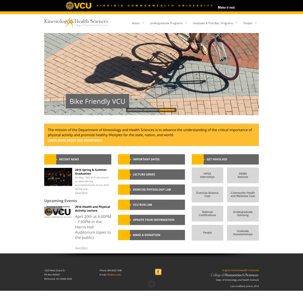
Here’s the original page. The screenshot below was made with the Full Page Screen Capture Chrome plugin.
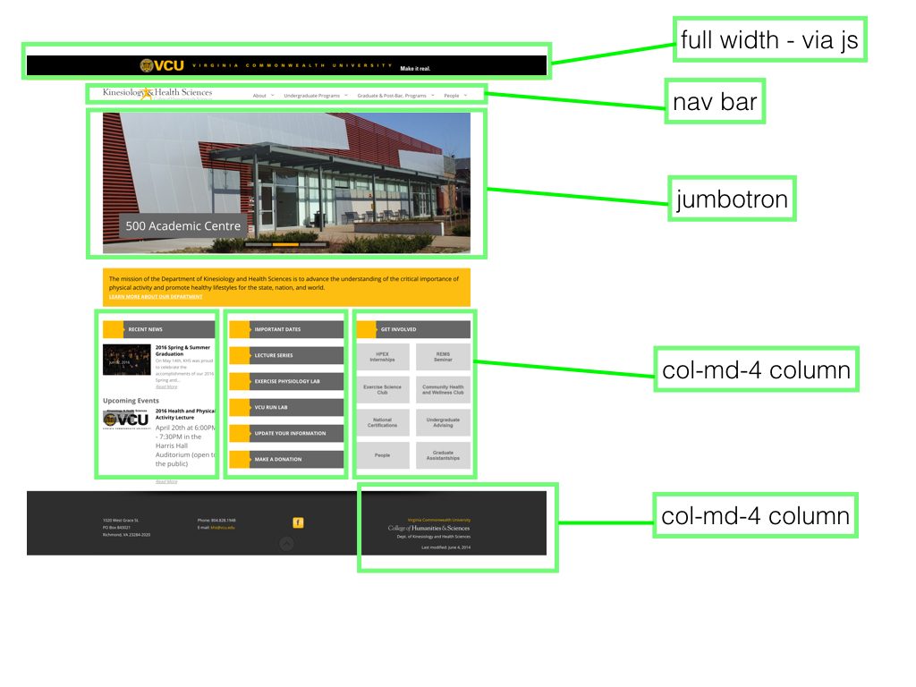
Step One – Framing
I’m using Bootstrap on this one because I’ve become decently familiar with it. I may use flexbox in the future but speed was the deal so I went with something I knew.
I figured I’d echo the framing of the first site (which is pretty typical in any case)-
- VCU banner
- header with some navigation
- a big picture
- a couple of text blocks spanning about a 1/3 of the page
- the footer
There’s some default navigation stuff I can paste in.1
From there I start to look at the body of the page as Bootstrap components. In my head I’m sketching it out in rectangles. In Bootstrap, that’s essentially Container>Rows>Columns. Everything is based on a 12 column width, so if you want to make something 1/3 of the page in width, you’d do put it in the class col-md-4. The md portion means it applies from medium sized screen on up. For lower-sized screens it’ll default to full-size (12 column).
Major Visual Elements
One of the first elements that makes the page look the way it does is the thick gold line under the VCU brand bar. We can do that pretty easily with the CSS. We just need to make sure we’re picking the right element so it’ll span the entire width of the page. We can inspect elements of the original page and see the colors, size etc. so we don’t have to guess.
.navbar {
  border-top: 15px solid #fcbd31;
  background-color: #fff;
  border-bottom: none;
}

.footer {
		background-color: #2e2e2e;
		padding-top: 50px;
		padding-bottom: 20px;
		color: #fff;
		font-size: 12px;
		font-weight: 200;
	}
The next piece that makes the page is the kinestheology image on the left. I stick in the navbar and give it the same width as it is in the other page.
 <div class="navbar-header">
          <button type="button" class="navbar-toggle collapsed" data-toggle="collapse" data-target="#navbar" aria-expanded="false" aria-controls="navbar">
            <span class="sr-only">Toggle navigation</span>
            <span class="icon-bar"></span>
            <span class="icon-bar"></span>
            <span class="icon-bar"></span>
          </button>
          <img src="imgs/KHS_website_logo_500px.gif" alt="Kinesiology and Health Sciences Logo" class="img-responsive" width="350">
        </div>
The big image box is easy to do with the jumbotron component. You can see the container>row>element pattern.
<div class="container">
  <div class="row clearfix">
    <div class="jumbotron" id="intro">
      <div class="words" id="content">
        <h1>LANDING PAGE!</h1>
        <p>
          Hey there! Here is some information you need.
        </p>
        <p>
          Click on the links and more information will appear.
        </p>
        <a class="btn btn-primary btn-large btn-gold" href="#">Apply Now!</a>
      </div>
    </div>
  </div>
</div>
You can stick an image as the background. In this case I did that with id=”intro” and set the css like so.
#intro {
		background: url('imgs/jumbo.jpg') center no-repeat;
		background-size: cover;
		height: 500px;
	}
Bootstrap has some built in button CSS classes to which I added a class to make it match the VCU colors.
.btn-gold {
		background-color: #fcbd31;
		border-color: #fcbd31;
	}

	.btn-gold:hover {
		background-color: #000;
		border-color: #2e2e2e;
	}
The other major defining visual element was the div headers with the gold square/triangles on the left. I opted to just take both the HTML and the CSS from the original site. So I used the inspect element option and grabbed both. Just a quick and dirty copy/paste.
	.title-block h2 {
	    color: #fff;
	    float: left;
	    margin: 0px 0 0 10px !important;
	    font-size: 15px;
	    font-weight: bold;
	    text-transform: uppercase;
	    line-height: 55px;
	    padding: 0;
	}

	.title-block .icon {
	    font-size: 30px;
	    color: #fff;
	    line-height: 55px;
	    display: block;
	    padding-right: 0px !Important;
	}

	.title-block .icon-container {
	    float: left;
	    background: #f2c025;
	    width: 63px;
	    height: 55px;
	    text-align: center;
	    padding-right: 0px !Important;
	}

      .arrow-right {
	    width: 0;
	    height: 0;
	    border-top: 10px solid transparent;
	    border-bottom: 10px solid transparent;
	    border-left: 10px solid #f2c025;
	    float: left;
	    margin: 18px 0 0 -4px;
	}
<div class="title-block">
	<div class="icon-container">
		<i class="icon icon-copy"></i>
	</div>
	<span class="arrow-right"></span>
	<h2>The Program</h2>
	<div class="clearfix">
	</div>
</div>
It’s not perfect but it’s fast and it works.
Then it’s just a matter of throwing the footer together and copying over the text/images and a few other pieces.
You can see the whole thing put together below. Still some detail work to do but that’s at least a rough path to making a doppelganger site via Bootstrap.
See the Pen Health Landing Page Demo by Tom (@twwoodward) on CodePen.
1 I think the VCU brandbar js messes up the “fixed” aspect but I haven’t bothered to figure that out yet.