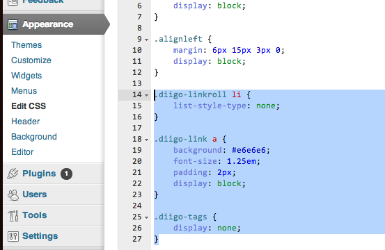
I haven’t found a better way to do the weekly summary posts than Diigo, so I spent five minutes messing with the CSS to make it look a little more like what I’d like. You can do this in WordPress from the WP Admin sidebar under Appearance>Edit CSS.

.diigo-linkroll li {

	list-style-type: none;

}
.diigo-link a {
background: #e6e6e6;
font-size: 1.25em;
padding: 2px;
display: block;
}
.diigo-tags {
display: none;
}
The first piece (.diigo-linkroll li) gets rid of the unordered list structure.
The second portion (.diigo-link a) makes slightly larger text and puts a gray background behind the links- which essentially function like headers for the different articles referenced.
The final piece (.diigo-tags) just makes the auto-included tags invisible. I may need to rethink this but it does clean up the post which looked far too messy for my tastes.
You can see the side by side comparison below.

Probably worth mentioning that editing CSS directly in WordPress is available by use of a plugin (there are several out there, I think Jetpack has CSS editing included in their suite of tools). I would love to find a way to automate something like this using Evernote which is how I’m doing bookmarks right now. My problem is most automation routines like IFTTT would create a separate post for each item rather than concatenate many to one post.
Good point. I think this is via Jetpack. I get confused at times what has been a theme/WP upgrade and what is a plugin I turned on and forgot.
I had the same issue regarding creating aggregate posts and so resorted to the Diigo path. This CSS has made me happier but I’m still not thrilled. I may look into pinboard some more as I have Diigo mapped to that as well.