
I had the opportunity to work with Ryan Smith again recently. He’s been putting in serious work on on his website (Richmond Cemeteries) and is now turning a portion of that work into a book (Death and Rebirth in a Southern City: Richmond’s Historic Cemeteries). Ryan came by to talk a bit about pictures for the book which led to a field trip (Hebrew Cemetery and Shockoe Street Cemetery) and I think some useful reflections on how the balance between technology, technical proficiency, and art works together to make something interesting. It’s a bit of rambling tour of a series of issues that are specific to this task (getting high quality images of grave markers for a book) but are also illustrative of larger things.
Basic Considerations
Light
Light matters quite a bit. When we looked through Ryan’s initial photos many of them were taken in very bright light. That’s good in some scenarios but leads to really hard shadows. In any photo, thinking hard about where the light is and how it falls will be key in creating the image you want. Usually you want the light behind you. Usually you want it to be soft.
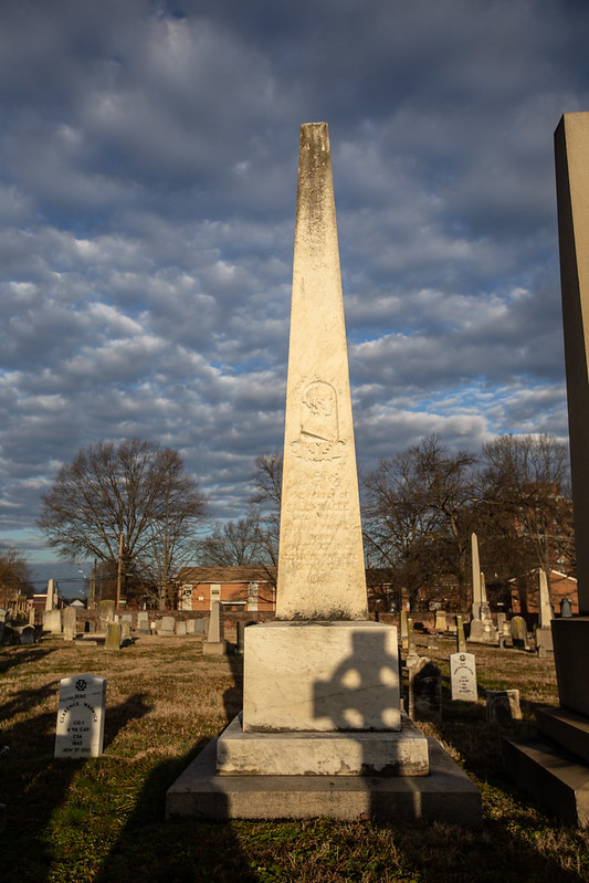
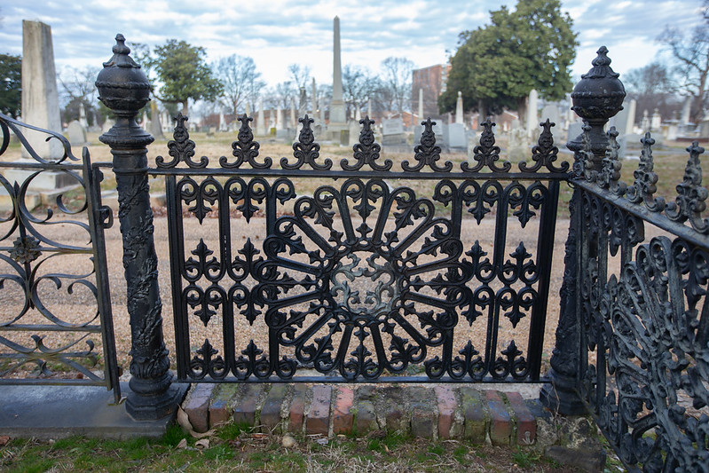
I showed up a little before sunrise but I didn’t have a shot list and I’d never visited the site before. That led to some mistakes or at least a poor use of time. I knew I wanted to get the “golden hour” light. That worked out ok but I didn’t really take into account the fact that the cemetery is on a hill. That led to the sun hitting one side very quickly. In the future, I’d take elevation into better account and work from East to West. I’d also visit the site once to figure out how I was going to work through the shots that were needed. You can see the better light in the first picture in this post and then how things become more harsh in the image directly below. The shadows from the markers in the foreground could be something artistic but they tend to distract from more functional/documentary images.
Depending on what settings you have for the camera, you’re also dealing with how the light meter works. The camera manipulates aperture, ISO, and shutter speed to try to keep all the bright parts from being too bright and all the dark parts from being too dark. The larger the difference between the darkest portion and brightest portion, the harder it is to get them both within the spectrum captured. That how you end up with blown out skies (so bright it turns to white with no details) or with shadows that have no detail (just featureless black).
You can manipulate where the light meter in the camera samples from to end up with more control. You can also take more control over all the settings. You can also take control over which things the camera can change. I suggest doing this gradually by using aperture priority and other camera settings so that you can focus on one variable at a time. This will help you build up room in your head to hold all the variables at once (while also worrying about angles, light, background, not falling off a cliff etc.).
Also consider that you can manipulate light to a degree. You can use physical reflectors. That can be a piece of poster board or windshield shades. That’ll let you bounce light back to help light up the shadowed areas. Off-camera flash is another option but it’s far more expensive and opens up another world for consideration. That’s great if you want that but most people want easier and less choice. The Strobist would be my first step down that path if you were interested.
Background
Background awareness is a skill. It’s easy to get tunnel vision. You see something awesome and you take the picture. All your attention focuses on the object in the foreground. You end up missing the weird things in the background that distract other people. Step one is being aware of the background and then you start to integrate it with intention. There are a variety of ways to do that.
Changing angles is one way to manipulate the background. People tend to take photos from their normal standing height. Take the gate below. I moved inside to shoot it against the less buy path. I did that by elevating the camera. It did some good things but also led to some things I didn’t like.
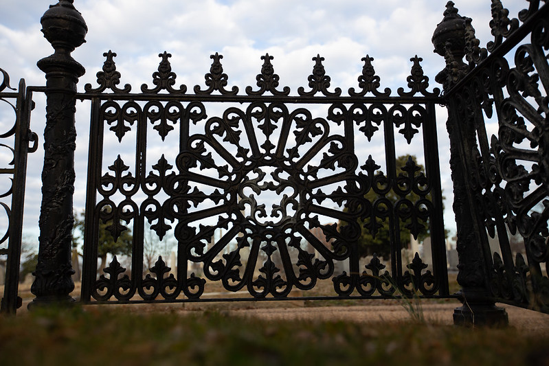
I could also drop the lens really low and try to shoot against the sky. That works in some scenarios. It doesn’t work so well in this case. It ends up being a bit too dramatic and the dark magnolia trees end up obscuring things. That plus the loss of detail in the fence makes this kind of fun but not usable.
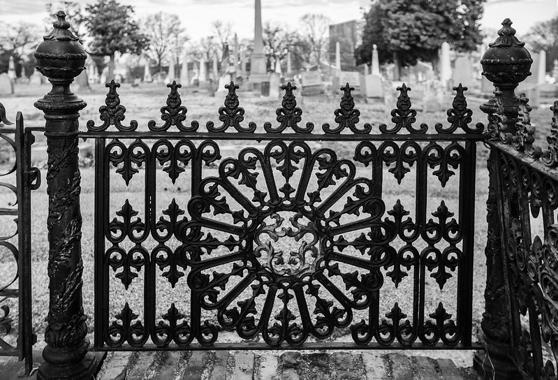
Given our scenario, I opted to retry creating some more separation using the path and keeping in mind that these images would be black and white in the book. Many cameras will let you preview the images in black and white. If you’ve got that option it’s well worth changing the settings if that’s how your images are going to end up. You may be able to “see” your color images in black and white but I find it very difficult.
This image is a fairly normal perspective and I did more post-processing work to get the background toned down. You can also see that I tightened up the crop. Another random tip, shoot wider than you need as you can also go back and trim it down but the reverse is not true.
Depth of Field
The other thing you can do to help create separation in images is to manipulate the depth of field. The shallower the depth of field the more the background will blur/bokeh. This is going to be mechanically limited by the lens. If a lens says it’s f2.8, that’s the widest aperture you have and will give you the shallowest depth of field. It also lets in the most light. You can now do more stuff with software and there are some additional fringe hardware options in the future but for most people it’s easier to do it initially. You can see that in many of these pictures.
Hardware
Taking pictures is not about the camera or lens except when it is. You can have really nice equipment and still fail to take good pictures but there are times when you cannot take the picture you want without the right equipment. Figuring out the kind of pictures you want to take and investing in a decent lens oriented towards that kind of image is a good idea. People smarter than me tend to prioritize lenses over camera bodies. You can certainly dwell too much on the hardware but I dislike just how easily some people say that “the hardware doesn’t matter.”
There is an endless amount of gear you can pursue- bodies, lenses, off camera flash . . . it all makes sense in different scenarios with different budgets.
Other Hardware
But there are also other pieces of hardware that people don’t really think of- ladders for bird’s eye shots, poster board/car sunshade for reflecting light, maybe a selfie stick etc. That stuff is far cheaper than high quality lenses.
Software/Post Processing
It’s not clear to me what the lines are here. It’s interesting to look at these National Geographic rules to take note of all the things that they consider. There’s a lot there but they don’t mention things like correcting lens aberrations or correcting perspective. Does this make the image more real or is it digital fraud? I don’t know. Lots of stuff to think about and in an environment that will only get more complex.
Stuff I Need to do Better
Backwards Design
I’m not used to having a focused academic goal with my photos. I usually shoot for my own amusement or towards some rough idea of being visually interesting. That’s not the same as shooting for a book. We’re not leading with an artistic idea, we’re leading with a point that Ryan is trying to illustrate. That idea of backwards design for photos was not something I approached in enough detail for this round. When we finished, we came back and looked at the original photos vs the new photos and talked through what was working and not working. That’s when the details came out that I should have figured bout better ahead of time.
The angel series below makes for a good example. In the image below I captured the statue with the sun at my back. I framed it such that I cut off a portion of the pedestal and you’ll note that the side I captured has the broken off hand. So good for the light but bad for the statue. We did figure that out in the field so I took some shots from the other side.
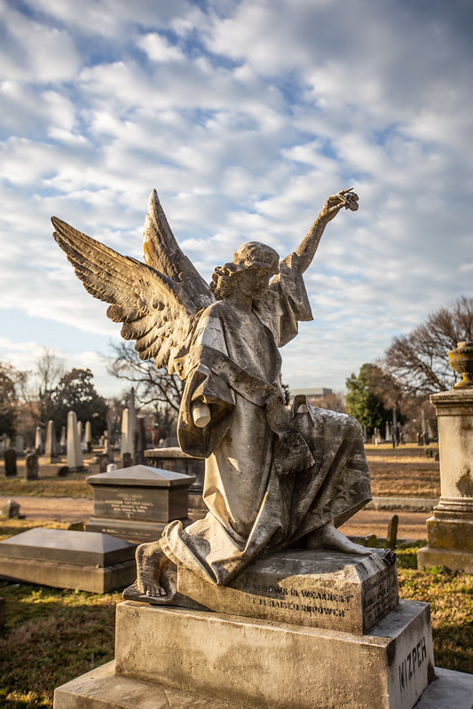
It turns out that the size of statue was also important. This shot deals with the missing hand but the position makes it hard to tell that the statue is large. It’s also moving towards artistic drama rather than a photo that represents what a visitor would see. It also came out that capturing the androgynous nature of the angel and some additional details were important. That’s all stuff I should have figured out ahead of time. I ended up with a variety of shots but none that really did a good job on all those elements.

We came up with this after we came back. It is something I will think about for the future. It makes for a nice way to do planning document if pictures already exist. I think doing some phone scouting would also work pretty well. It’d give you a chance to go over the location and have something real to talk and work with.
It may also be that we can’t do all those things at once. We may have to decide on the top goals. It’ll be difficult to get the detail of the face and the entire piece in the same shot. That aspect of having to choose only one image is much more of an issue for books than for the web. Digital would open up a range of possibilities and interaction options but that’s for another day . . .

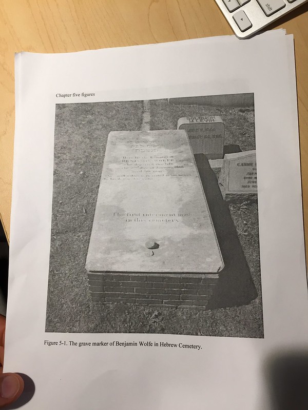
You can see a similar struggle with documenting the first marker in the cemetery. One goal was to make it legible but we also wanted to show the whole thing (including that it not flat). That was complicated by the fact that the left side was pretty tightly crowded with other markers. You can see in the original photo below that you’ve got a hard shadow from fairly harsh sun. You can also see the other markers intruding a bit.
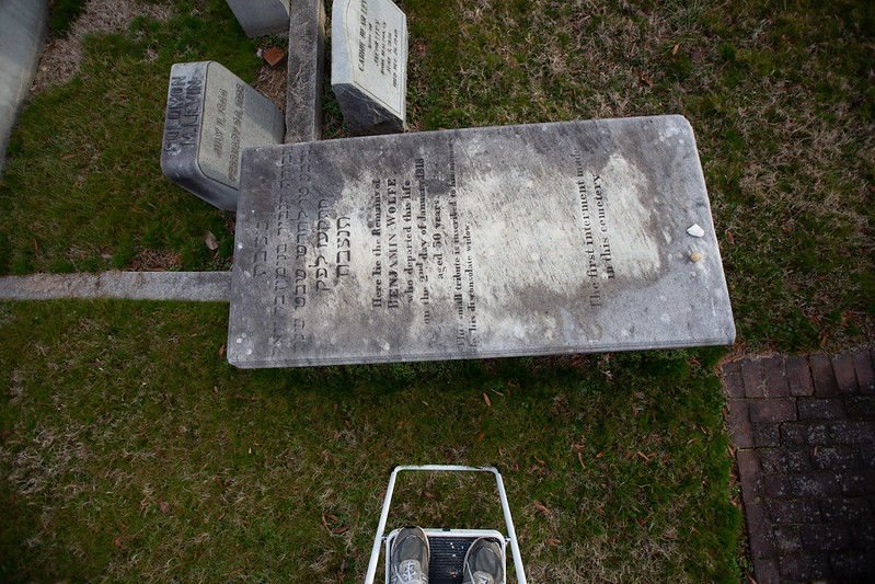
You can an attempt at the overhead view using the step ladder in this image. We saw on-site that it wouldn’t work because while it’s better for legibility it makes it two dimensional.
Here we try framing the marker more tightly. We get the lower script and the rocks but we lose the writing in the upper portion. It gets the three dimensional aspect but we have the brick walk creeping into the corner. I’m not thrilled with the contrast in general. This is one I’ll probably reshoot.

I feel like I learned a lot in this attempt. It has also further helped me hone what I share with faculty and how I try to scaffold their photography skill acquisition as they consider taking on these skills. This is extra work for them in most cases and work they take on in an entirely practical way. “What is the least they need to know?” is the question I must keep asking myself. “What is the easiest path?”
As I had expected/hoped, our venture together to try to get these shots was different from my own previous photo sessions at the cemeteries. My biggest takeaways from this session were the simplest.
I usually pay attention to time of day and weather on such trips, but our start time – dawn – showed me just how deliberate those choices need to be. Related to that, I also knew that light source/direction was important but had assumed that the brighter the light, the better. It is easy to see now that blinding, reflective light is not usually ideal. And it was very helpful to think about the black-and-white end result even while shooting in color first.
Also, I had not really considered the background in my images before. After I saw the effectiveness of cleaner backgrounds in the angel and fencing images here, I have been looking through my older photographs to find the gravemarkers “sprouting” all sorts of weird appendages behind them (trees, other markers, etc.) that I was assuming the viewer would be able to distinguish on their own. When possible, it seems best to cut those out in the initial framing.
I also learned a lot about what I was trying to show with these images. In the world of publishing, one has to justify the extra expense of printing lots of images. It all forces a deceptively simple calculation – what is this image trying to accomplish? What’s the main thing it should illustrate? I got much further down this road through the exchange with Tom regarding goals and what was working or not in our shots. It can be more nebulous when all this remains unexamined/impulsive in my own head.
Tom’s active assistance here gave me a lot more confidence for my own improvement down the line. At the same time, his conclusion at the end about faculty priorities is spot-on. The temptation here would be to acknowledge that pros or more experienced photographers can simply do better and to hand off such responsibilities to them. But as we’ve seen, going through this process is a form of visual analysis in itself; it helps one think through the images in a more active way, so it is important to resist the temptation to totally hand it over. There’s probably more stepladders and tinkering in my future.
Good to see the thinking behind the pictures! Thanks for sharing!
You need to be careful or you’ll take Alan’s place as the most prolific commenter on this site. 🙂