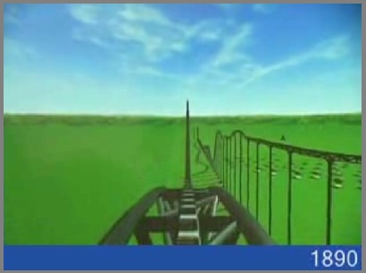

U.S. Housing Prices
The first example is an animated roller coaster ride of US home costs adjusted for inflation. It’s a pretty dramatic and entertaining way to look at the data (link from Digg). It makes a graph “real” in a way that I’ve never really seen before.
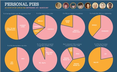
Personal Pies
Personal Pies (great title) is even better because it allows your students a lot of flexibility in the product they create and the data couldn’t be any more relevant to them. He’s created pie charts for his life- everything from portion of life with beard to number of states he’s visited (there is one non-school safe “pie” so be warned). This is a perfect project for students dealing with pie charts and percentages. (from Anil Dash)
I think these examples are important because they prove that data (or anything else for that matter) doesn’t have to be boring or presented in boring ways. I try to think about two things when creating project/presentation or anything else-
- Is this going to fun and original?
- Is this personally relevant to my students?
I guess both those really focus on engagement. It always amazes me how little attention the difference between engagement and silent acquiescence gets.