I work in a decent sized school system. We have 69 schools and about 50,000 students.
That means we have a lot of teachers, a lot of teachers teaching the same content, a lot of teachers struggling with the same problems, a lot of teachers re-doing work that’s already been done.
At a district level we spend untold hours and untold amounts of money trying to provide support for teachers and trying to promote best practice. We have teachers who exemplify the concepts we’re trying to share but they are, too often, unknown outside their school, or their grade, or their subject, or their classroom.
So our current goal is to end anonymity, to effectively publicize best practice on a global level. One of the ways that we’d like that to happen is through online content distribution and building conversation around that content. The ability to put multimedia content online is nothing new. What has changed is the facility with which it can be done and the ability to easily have conversations1 around very specific pieces of media.
Changing the concept
It’s important to look at how educational content sharing has failed in the past and present if you’re going to try to get it right. I looked at as many different online sharing options as I could find.2 I’ve also been on the user end of a number of systems.
I think we can go ahead and skip the file hierarchy systems. They suck in such a huge number of ways. There’s no visual, no readily available meta data etc. etc. Their one benefit is they’re easy to publish with but that’s not much of a benefit when no one bothers trying to use them.
The place I’d like to focus is on the database backed web content creation systems. I think it’s key to have them on the web and open to anyone who’s interested and it’s key to have the database backend to prevent needless duplication and other hassles for the creator and consumer.
There are two big places these systems tend to fail. They can fail to provide what the consumer needs and/or they can fail to facilitate the creation of content on the producer end. I’m arguing that these two aspects are more tightly linked than it might initially appear. I see both issues stemming from a misunderstanding about what teachers want out of these sharing sites. Most sites focus on providing a highly structured and rigidly standardized lesson plan format. Essentially, ‘Here is your lesson in a box.’ I don’t think that’s what teachers want and it’s certainly not the way you get teachers thinking about changing practice. The other path for these sites is ‘Here’s your widget to add to your widget collection.’ The most interaction either option tends to give teachers is the ability to rate the content.
I think we’re pitching the wrong content and doing it in the wrong way. “This is perfect. Download it and follow the directions. We know what’s best.” is not a message that works. People drop in, they glance around and if they don’t find engaging content before having to go download a file, they leave.
My Pitch
So here’s my pitch on how I’d like to see this system work.
Philosophy: Teachers are looking for inspiration and community as opposed to directions. This is as much about the conversation that occurs around the content as it is about the content itself. As a result –
- loosely structured narratives should replace highly structured lesson plans
- content should be housed in a way that encourages conversation to occur around it (as opposed to elsewhere)
- it’s not just about perfect finished products, this is a valuable space for exploring ideas
Display
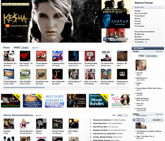
Main Page: On the consumer end, you have to make this content look interesting and keep it fresh. What shows up, as well as how it shows up, is absolutely key. So my main page would be very similar to the way a number of consumer sites work. I think those sites have quite a lot to teach in terms of what people expect and want when browsing for content online. I think iTunes is an interesting model to look at. It has a wide user base and I think it does a good job of displaying content.3

We’re not talking rocket science here. Many blog themes also echo this display format. Essentially, you’ve got a larger box that is animated and shuffles editor designated content. Then you’ve got some content showing up based on user interest and activity. All of this is visual and allows the user to drill down into more specific detail. It is simple but it’s also the opposite of nearly every education based website I could find that shares content. Apple’s Learning Interchange gets close on the display side. I also really liked the revamped look of the CUNY Commons site. Compare these initial interfaces to sites like Merlot, Lola or the OER Commons. I’m not arguing content, social purpose etc. here. I just want you to look at the page and compare how you feel viewing it.
Search: The next place people will end up is the search page. There are so many ways this is done in unpleasant ways. I’ll use the Merlot example below because it’s actually one of the better options but suffers from pretty universal flaws.

The only image on the page is the “Editors’ Choice” badge. The data is laid out in ways that don’t really take advantage of the space, nor do they use formatting to help make the data more legible. I found the dual star based review systems somewhat unpleasant and for some reason it was hard for me to count the stars. What data is present in this view should also change pretty radically if it doesn’t function as a link to other information in that same category.
I remade it with the same essential information below.
 4
4
or alternately

In a perfect world, I’d probably have a number of things activate based on mouse overs. So you could get a better description if you wanted it but a lot of the initial interest would be based on the look, title and metadata regarding ratings and conversation.
That’s probably enough for now. Next time around I’ll get into tagging, searching, aggregation and what the content and conversation might look like.
1 I’m defining ‘conversation’ pretty loosely here.
2 Feel free to send me any good examples you’re aware of. I have no need of additional bad examples.
3 Music is not an inherently visual piece of content but album art has played a major role in its packaging for some time. iTunes certainly takes advantage of that.
4 You may say that image sucks and has nothing to do with the content. I’d agree except it’s from the content which sucks in ways I have a hard time explaining.
It sounds to me like you’re looking for a wiki. Maybe a little higher fidelity than Wikipedia for that front page, but that’s a matter of style not technology. Talk pages would serve as the conversation piece for each lesson, giving the benefit of separating the content from the discussion of the content, but still keeping the discussion focused in one location.
Chris- I don’t think so. I want to the content and conversation to mesh – something along the lines of digress.it maybe. I think a wiki might work but I’m not a fan of how the navigation and construction aspects work- too much pre-planning seems to be needed compared to other methods. I’ve also had very little luck getting most people to use the actual wiki aspects of wikis.
I don’t know if this if for later, but would it also include teacher pages? Meaning, if a few teachers are adding a lot of good content, would they have a page, like an artists page? I like the iTunes look and feel model, that way social studies folks can easily click into English, also. The big question is, how will you ensure it won’t get named “School…” or “e….”?
You’d be able to view content by author if you found someone you liked. That’d be pretty easy to do.
I can take care of the name. I will take care of the name.
This is the way we built ours. Not perfect, but we are still working on it…and the content.
http://www.enimitz.com/1to1/
Appreciate that Deanna. I’ll take a look. It is a big job.