Heroku got rid of the their free access a while back. I have one Node JS app on there that knits together a Slack form and WordPress site. I went to the trouble of upgrading to the bottom tier paid account with Heroku. It’s $5 a month. At that point, I thought I was done.
I needed to actually turn the thing on though. Which is probably made clear someplace, but the interface for doing was not very intuitive to me. It may be that you’re meant to do it via the CLI but if you’re going to have a web interface for it, this one could certainly use some work.
I’m not providing alt text for the images because I’m describing them in the text. I believe that renders them decorative.
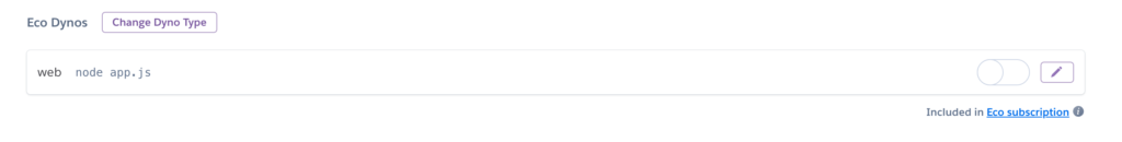
The first image below is the Dyno not turned on. You can’t interact with the toggle switch. Judging by the text in the upper right, I could tell Eco Dyno was an option. The slider element is to the left and the empty space is not filled in.
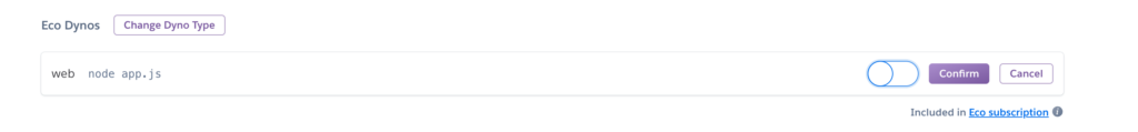
The second image is what happens if you click on the pencil icon. There are two new buttons saying “confirm” and “cancel.” The confirm button is dark purple. The cancel button retains a white background with purple text. The slider is now active. It retains its position on the left. Because I’d clicked on it several times in the other view, I focused on the new elements and clicked them. I just assumed the slider element had remained inactive.
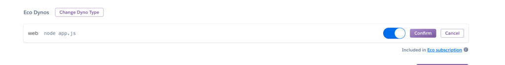
The third image is what you’re supposed to do- click the pencil, then click on the slider so it moves to the right, and then click confirm.
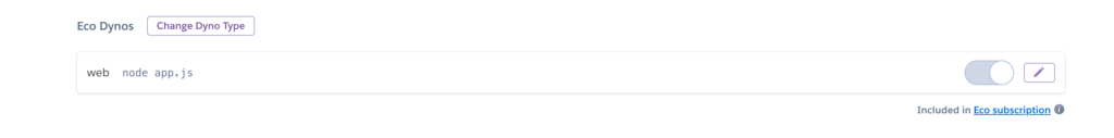
The final image below is the Dyno when it’s turned on. Everything reverts to the default color scheme. The slider is rendered inactive and is gray and positioned to the right with a gray color filling in the space to the left.
It all makes perfect sense once you’ve done it and I feel dumb. I’m not a complete idiot and I’ve used more than my share of websites, but I first struggled with what the problem was with my app, then I had to find this interface, and then I had to figure this out. It just didn’t feel as easy as it should be. It feels like, in most cases, you’d want to make it really clear that a resource was available BUT that it was inactive. You’d want to really encourage people to turn it on because it makes you money and without turning it on – nothing works.
I think labeling the slider button “inactive/active” would help both accessibility and understanding. It wouldn’t hurt to add a color/icon combination. It feels like once it’s running, you’d have a better visual and text signal.
User interface design is difficult.
This is one of those UI’s where, sadly, you just randomly do a regression of random clicks until it “looks” like it’s up. There’s things like this in Protonmail and Lastpass that I’ve bumped into like this, definitely.