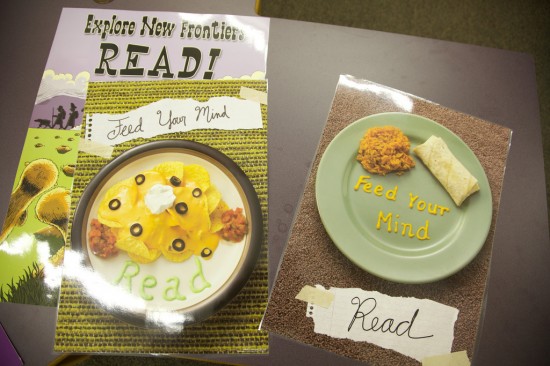

I saw these two posters ready to be hung in an elementary library. I was amazed.
I showed this picture to two teachers and said “Can you believe this?” They had no idea what I was talking about. I was sad.
OK, let’s get passed the whole crappy idea and the fact that they’re wasting wall space that could be put to any kind of better use.
Look at these posters. The food looks horrific. It’s low level cafeteria food. One of them has the food on the floor. I wouldn’t feed that crap to my dog, let alone my brain.
Why is there mustard with the Mexican food? What the hell is that neon green stuff with the nachos covered with a few dessicated olives?
Seriously. Someone may have spent money on these posters or at the very least took the time to laminate them and then put them on a wall. That might have worked in the 1920s but kids today have seen decent images. They’ve been marketed to. They know that even McDonald’s food looks good in posters.
I know it seems I’m making a big deal about nothing. Maybe, but I see this as a good example that we aren’t paying attention to details and are still living in a world where those kind of crappy posters might do something other than be objects of mockery. Comic sans, clip art and crappy posters simply don’t cut it in a world of media saturation. They just make us look lame and clueless- even in elementary school.
We need to pay attention to details. We need to think hard about the media on our walls. We need to think hard about what we make and what kind of impact it makes. This stuff matters. It is by no means the only thing but it’s part of the game where we’re sorely lacking.
This reminds me of the posters we have up in our media center/library. They were also geared towards encouraging students to read.
Each poster features an administrator from the school reading a book (presumably their favorite book, but you can tell that some of them just picked up a book sitting in their office).
One of the Vice Principals took a _horrible_ picture, and his bloodshot eyes make him look like he’s high. The rest of the posters are lackluster enough, but that one really takes the cake. Two years later, I’m still amazed that the photographer (a teacher at the school who was also a professional photographer on the side) didn’t re-shoot the picture.
Your point is extremely important, for like you say “they’ve been marketed too.” And for far too long education has been so deluded by its own sense of entitled privilege in the minds of students, that it has totally abandoned an y sense of truly trying. And for me that trying is reflected in the details, and it also frames just how much the whole institution has ignored ideas of space, and more importantly aesthetic approaches to engagement and empowerment. What those teachers should consider is bringing your critique of these posters into the classroom, and then charging the students to make something better from what out there already, to frame their own aesthetic, and critique that.
I think a couple years back the first thing I commented on on the Bionic was the Read posters with Jay-Z, and there is a good reason for that. Aesthetics and cultural relevance is absolutely essential to contextualizing and making relevant a learning experience, and schools have all but ignored or completely screwed up that impulse. Remember we saw Ed Ayers talk about this very thing in his freshman Seminar course, the relevance of contemporary culture—which is often pop culture—is an essential key to understanding who and what we are. So rather than pretending it doesn’t—read the insane bans on all things internet—or it is somehow inferior than what we are teaching—it’s high time it becomes part and parcel of everything we teach.
A new school, a new frame, an approach premised on media and cultural critique. It would be an awesome experiment.
I often put a critical eye on the things that hang on classroom walls. I like the idea of using wall space to extend learning opportunities…educating rather than simply decorating. The comments here have me thinking about perhaps including kids in the decision-making that goes on around how our wall space is best used. Maybe taking the time to define what students need the most support around as learners, and then using the space to provide them meaningful tools could help?
Angela- great point and yet something probably rarely done. It would be interesting to see what a room/school decorated by students would look like. I bet it’d be something totally different.
Tom,
Wonderful post. I’ve been in too many classrooms and sat through too many lessons where it’s obvious that there is little or no concern for the details.
I agree 100% – these things DO matter. One of the “games” we play in the house with our two kids is picking out the typos and poor design of their schoolwork.
Students notice these things and yet teachers can’t understand why kids won’t take their work seriously.
Thanks again!
glennw
Glenn-
That’s an interesting game. I’ll have to do that with my kids when the time comes. Until then they just have to deal with me breaking down TV shows, junk mail, commercials etc.