So Dan threw down a challenge as he tends to do. I did the easy part but also felt I should do some critiquing to maintain some credibility in my own mind.
I’m taking a shot at how I might change Ms. Mercer’s Powerpoint presentation. The main thing that made this difficult is I don’t know what she says during this presentation and that stops me from really considering how I might change things more fundamentally. So the following is given in the hope of providing helpful and positive feedback for Ms. Mercer. Please excuse any mistakes I make while attempting to determine intent.


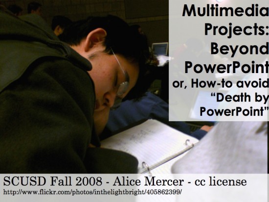
Here are the two title slides. Ms. Mercer’s slide will always be on top.
I found that slide to be a little heavy and dark for my tastes and wanted to go with something similarly humorous but a little cleaner. I found a warning slide about killer electricity and dropped the background in Keynote using the Alpha Channel tool1


Here I’m just simplifying. If I’m going to be out there talking, I don’t feel I need any more specifics than this. I might drop the slide altogether.
I’d probably use this slide to get the audience talking about why they use presentations. Get some top answers and then move on with what I’d bill as pedagogically and brain based rationales for using presentation software2


I’m sure Ms. Mercer has a story to go with the chair image but I couldn’t figure it out (which might be a good thing). I like the chairs- the colors are interesting. I’m not sure the rationale for having the flickr rating in the image.
I opted for these crazy looking poodles. I might opt to make this an animation slide starting with a small picture of an innocent looking poodle and mentioning that I’m terrified of poodles. I’d ask the room who else might be scared of poodles then switch to these crazy looking animals and say that visual support is often essential to proving one’s point.
I like the image because it’s dramatic and with or without the story it’s fairly humorous to see poodles as scary (at least to me).


The kids are cute but the image is blurry. I’m not sure it gets to the point I’m guessing is being made- which is that PPT is a good way record pair shares and story talks.
I went with something fairly simple. Mic = record. I didn’t really even want to limit it to pair shares and story talks but just emphasize that the software does a good job recording things in various ways. The image is mine and was used partially out of laziness and partially because it was in the image bank in my head as something that would fit. It’s not bad, but there are better ones out there.


Ms. Mercer now had a few slides in a row of ways to use this to capture and display student work.
I opted for the idea of presentation as refrigerator. You know, the place you put up the great work your kids bring home. You could also use it as a digital bulletin board. That type of thing. I might show some pieces of student work. I’m not solidly sold on this concept as I’m interpreting it but, once again, I don’t have the full story.


Here the idea is that to make good presentations you need a solid, recognizable goal. I didn’t like this shot because the goal was kind of hard to make out and I am in VA so a hockey goal would be somewhat confusing3. The blur and the brightness of the background didn’t help things but that may be my wannabe photographer self coming out.
I’m not sure I’d keep the text here or in the previous slide but I left it in to keep things a little more in line with what Ms. Mercer’s original line of thought appeared to be. Once again, this is one of my own shots chosen out of semi-laziness. I just wanted a clear, fairly plain picture of a goal. That’s all.


I was fine with this picture. I don’t love it but I’ve got no issues.
I ended up just putting up the word plan. I initially had blueprints. I then went with a picture of Hannibal from the A-Team4 and then finally I did a hand made drawing with the vector stuff in Keynote to do a bunch of loops ending in a red X. I didn’t like any of them that much so I just went with plain. It’s ok.


This was another decent picture and I liked the goal. I just found the scaffolding harder to make out because of the color and pixelation of the image.
I went with something I felt was a little more dramatic. I like how this image allowed you to clearly see what the scaffolding was supporting. The imagine did not initially fill the page, so I took a quick screen shot of the outter left edge and copy/pasted it until it filled in with the solid gray that it now has.


Here I felt the Bloom’s diagram was too complex for people to get anything out of it. I’d include it on a hand out if I felt it was key to the final understanding. I figure the main point is to talk about higher order thinking skills . . . so I used the mountain shot. I played around with some meditation shots and probably would have used one if it had been decent. I was going to make it look like the kid was hovering a good bit off the ground but the shots all would have taken a fair amount of work to crop out the background and I am doing this for free in spare time after all.


From here on I skipped around a bit and went to slides I felt a little more strongly about redesigning. Doing this, especially this way, takes some serious time and effort. Seriously.
So the first image didn’t really say feedback to me. It looked more like a teacher telling students stuff but that could be because of my own deeply buried educational baggage.
I thought about it for a while and decided a Post-it style note symbolized feedback to me. To get this I used the note feature in Keynote and then just took a screenshot of it and put it in as an image. Simple, easy, quick. Fairly acceptable visual result.


Here’s one where I think what I did actually makes something of a difference. Ms. Mercer is talking about quality vs quantity. She uses the rose as her analogy which I think works for some but not all. My bet is that everyone can relate to cupcakes. So here is one small, beautiful cupcake sitting in lonely isolation. It is clearly a work of art. That’s also probably what I’d say when showing the slide.
It was set small and isolated on purpose. It’s meant to be. If you made it larger you’d be ruining the point. This is one small, exquisitely crafted thing.


The problem Ms. Mercer was having was that some people were saying they liked this yard better than the rose. So I’m working the inner guilt path. Even if someone would rather eat the 15 or so odd horrific looking snack cakes here, they know that the quality of the single cupcake is superior and a better choice. The few who will definitely say they prefer the mass of junk will really only reinforce the point- it’s better to have students work on making superior products than to have them churn out masses of garbage.


I think the marine guy would be usable if you had him on video saying something nice but in a drill sergeant’s voice. The text gets too confusing as it is with the other competing visual elements.
I changed the statement to some extent to reflect the way I see visual design. It is what you’re saying and how you say it. This would give me a brief chance to talk about color and font. I don’t know if I’d have to be this heavy handed. It actually hurt me to make this slide but anything in the name of ending the scourge of bad fonts.


I changed Ms. Mercer’s original photo so the top one is one I put back roughly the way it was. I’d use the fact that it doesn’t initially follow the rule of thirds and just show how you can enlarge and shift it some so that it becomes a stronger photo. Looking at it now, I might even move it farther to the left.
If the people know you I’d keep this for sure. If not, I’d probably go with another photo or mention that it’s your son explicitly and that you took the photo to get that emotional linkage going. Photo wise, it looks like the background is actually in focus and your son is slightly out of focus.
So there’s my $1.50 worth of comments and at least a few alternate ways of looking at the presentation visually. My guesses could be way off but they were done with a pure heart and for the good of the cause. Hope they do something good for you and maybe for someone else out there.
1 This aspect of Keynote alone makes me so happy it’s hard to verbalize. Sad but true.
2 I do some stuff on neuroscience and presentation so that’s probably why I want to go into that channel so readily.
3 That is opposed to my hometown of Hunstville, AL- the hockey capital of the south (really).
4 The “I love it when a plan comes together” guy. I have to keep a close watch on my own odd sense of humor in most of my presentation.
Thank you Tom. I think a lot of these ideas are really great. You have a stronger grasp on typography (which I’m just starting to explore) so props on that.
The ONLY issue is with that Visual Support slide.
First, is a boo-boo on my part, I accidentally pulled a copyrighted photo instead of a CC one and left of the citation (all unintentional on my part). The owner has kindly given me permission to use it with students and teacher for educational non-monetary purposes only, but I need to get the citation in: http://www.flickr.com/photos/18092121@N00/510438754/. Thank you Buddha’s Ghost for being a forgiving “deity”, and I’m sorry to drag you into this Tom.
Next, there was a particular reason I used a photo from flickr, and how I framed it. I was explaining how I use the intriguing titles and tags and how they relate to images to teach about idiom and symbolism. This may give some context for that. So, it needs to be a flickr photo with and interesting picture where the title conveys some symbolism or idiom. It doesn’t have to be that flickr photo, but you get the idea, and why you would want the title to show.
You did much better with the cupcake, and I think I had conceded that as not working already.
The pair share vs. record, I did the one with kids because that is what a pair share (analogue) looks like. I think you’re right, it needs a mic, maybe a photo of my own (although you see what my photography is like from that pic of my son), of kids making a voice thread, might be better?
No argument on Bloom’s. There is a simpler pyramid style graphic I could use there too, but I like the mountain. How about a simple transparent overlay of Bloom’s pyramid for the one person who has never heard of it?
Thank you for your feedback. I know I likely have the best PP designs for an elementary teacher in my district, and I know from my trainings, I have a better slide deck than most of the high school admins (who are still torturing their staffs with text heavy slides), NOW,with your help and the help of others, I can move on to being better in a larger context.
I thought there was a rationale I was missing. This was fairly difficult to do without having a better idea what your talk sounded like.
For the pair share, I’d probably include the example or link to the voice thread. I think that was Dan’s comment regarding my presentation. Essentially, use the presentation to tie different media types together.
With Bloom’s, it’d just depend on how far I was going into things. If my point was just to mention that you should use this to address higher level thinking skills then I’d leave it out. If you wanted to dig in deeper with Bloom’s then I’d leave it in but it seems like that’s a big topic. The simple version would probably work. I might show a few examples of how to use presentations to address the various levels.
The impersonal land of electronic text is a rough way to get and give feedback. It’s hard to do things in the way you’d do it in person. I think that’s part of what leads to people not doing it, that and the huge amount of time it takes.
Your stuff is good. I figure we each have our own visual aesthetic as well. With presentations you also have to add personality so that all impacts what you make and what will work for you. I gave samples of how I might do things but, by no means, is it the right or best way. I probably don’t need to say that but we’re in text land so I might as well be explicit.
I look at my stuff a week later (or the day after) and change things. I see other people’s work and redo whole presentations. It’s a continuous process but having feedback from people helps at times.
Glad I don’t seem to have crossed any lines and might have done some good.
Tom
Exactly. At this point, it seems we have defined the design challenge as “What image would go well with this word and how do I balance that word on top of the image?”
That task is simultaneously a) much harder and b) much less meaningful than how we ought to be using PowerPoint.
Maybe I’d find this in the original presentation, but rather than picking stock photos to pair with the words “student work” and “recording” and “plan” wouldn’t it be more meaningful to show student work or to show a think-pair-share discussion (with video!) or to show an example of a PowerPoint lesson plan?
Dan, that’s a good point about showing actual examples. This particular show was the easiest for Tom to pick up and was on a pertinent because it’s on presentations. Here are some achilles heels:
1. The organization of the original presentation was not as tight as it should have been. I was trying to do a preso on Web 2.0 alternatives to having students make PowerPoints. I compromised on that because when I first gave it, someone complained that the title had PowerPoint in it, and I didn’t cover that at all. So, I shifted a bit and added stuff on Death by PowerPoint. This compromised the my thesis and compromised my core message. You may have sensed the lack of strong central thesis.
2. The actual presentation was marred by technical glitches, such that I did not get audio, as I did in my other two presentations, so it’s divorced from it’s audio context. You probably would have heard a lot of swearing if I did manage to get audio recorded, lol.
3. I have gone back to flat/still images rather than examples in some cases both for technological reasons (see #2 above–I always like to be able to do my preso, EVEN if the Internet is down). I also do this because I have a lot of newbies in these sessions. They can freak out when you show a succession of Web 2.0 tools rapidly, as examples, so the photos were meant to convey what they knew (pair shares, teacher’s giving feedback ftf), then I TRIED to show examples at the end. Since I do 2 hour presos for the district I’ll spend about 30-40 min on ground work, then examples, then how-to, and hands on for last hour. I’m NOT wed to that format. I would do this MUCH differently at say, CUE.
Your feedback is welcome, and I will definitely consider this seriously should I be doing these presos next year.
Tom really went all out on this. I can’t believe he did the whole preso. I would suggest that in the future, we do a snippet of a preso (like when I pulled out a couple slides) with audio.
I agree. I over did things and in the end while it was a lot of effort, that effort was misplaced. It would have made more sense to focus my attention on key aspects and look at things more holistically. I should have addressed conceptual things and illustrated them with single examples. That would have made more sense and saved me a lot of time.
I like the idea of redoing a few slides from a deck. It’d be a fun option along the idea of Dan’s “What can you do with this?” or an aspect of the Iron Teacher thing (assuming it gains some traction). I’d love seeing what other people would come up with for the same concepts or questions.
I’m thinking more and more about how to do staffdev things with questions as the driving force like Dan’s doing with the Math stuff. It’s both really simple yet really hard for me apply in a way that I think will work in what I’m doing right now. I can think of lots of ways I could use it in the classroom with English or Social Studies but I get more uptight when thinking about trying to do this with semi-hostile/hostile adults.
I have faith in the model. It makes sense to me. I’m not sure where the block is.
I’m going to try it this Friday and see what happens. What the hell.
It’d be fun to have a pretty reliable set of on-call “presentation redesigners” who could take “support tickets” as they came. It’s important, obviously, not to misapply the effort, though. I took on one of Darren’s slides hoping that, the next time he posts some slides, he will have modified his approach across the entire slidedeck, a workflow that assigns the right burden to the right parties. I think.
I have a lot of empathy for your paragraph about staff development. Daily, I wobble back-and-forth between enthusiasm and depression when I think about these blog things as outlets for professional development. Working the same magic in f2f professional development is, I suspect, another battle entirely.
This is cool. I’m a very visual person, I presented for years both locally and at NECC. I really took my presentations seriously spending hundreds of hours on them and ended up IMO with some great visual presentations. I think with some of the slides less is more–the rose/cupcake is a perfect example. Breathtaking photos one after another can loss their ‘umph’. I like the idea of interspersing text only slides with picture slides. Keep it up Alice, Dan and Tom.
Dan-
Point taken. I have a tendency to over do things. Occasionally, I learn from my mistakes. I did in this case.
Staffdev is an interesting place. It’s important stuff but so often sucks so incredibly bad that it seems it must be intentional. I’d like to change that. I’ve had mixed results so far. Hopefully my success to sucks ratio will keep improving.
Amen my brother on staff development. When I did this preso, one HS teacher talked about an admin who INSISTED on reading from text heavy slides for one hour in spite of the teacher (who taught PP to the students), you shouldn’t do it that way.
Nancy I hear you about too many pretty images. I was worried that I was making my stuff inconsistent visually overall by having text slides, but I’m thinking it’ll be okay.
Dan, on the staffdev stuff, it’s a whole different ball game in some ways presenting to folks in district vs. outside. Just like ed tech folks are in a cocoon, so are some of these teachers, but I’m running into more and more who have, thankfully, given up worshiping at the alter of our Language Arts text series.
Tom, Alice and Dan … just wanted to butt in and say how much I’ve enjoyed the cross blog pollination on this slide redesign theme. I am very much a learner in this whole area of visual design and like Alice, I know that my stuff is quite a distance in front of most teachers I interact with on a daily basis. Unfortunately, that makes their design methodologies woeful because as your collective posts point out to me, I have a lot, lot, lot to learn before my own presentation stuff is as good as it should be. As interactive whiteboards have spread like the plague across Australian classrooms, concepts like excessive text, suitable fonts and colour schemes are all issues that teachers should have some interest in improving – or that great digital tool they are now wielding could become a tool of torture or even worse, patheticness (is there such a word?). Good job – I know I’m not confident enough to critique anyone’s work on the web – my easy beat opponents are not paid up members of the edublogosphere. Cheers.
Graham, I would urge you to share your thoughts. I’ve done another redesign project here:
http://mizmercer.edublogs.org/2009/04/16/thanks-tom/
You will note that not everyone giving suggestions was Dan Meyer, and they were very usable, as shown here:
http://mizmercer.edublogs.org/2009/04/23/running-with-it-the-proof-sheet/
I was happy to see Dan participating, and Tom was a gem with this. What I’m really happy about is seeing Lesley and Nancy pitching in. That portends a much more sustainable effort on this.
Graham- I wouldn’t define it as butting in considering we’re begging for participation.
I’ve always considered blogs kind of like brainstorming. I benefit from other people throwing their two cents in. It makes my day. Otherwise, I’d just turn commenting off and go on my merry way.
We’ve got a storm of interactive whiteboards joining our 20,000 some odd laptops. It makes for a lot of interesting challenges. If you’ve got any prime examples of use, I’d be interested in seeing them.
Tom and Alice, you’re both right. I need to get over myself and just wade in and “have a go” – all I can offer is an opinion and my own ideas. I also can’t expect anyone to critique my own handiwork if I’m not prepared to pick up a few gauntlets around the place. Doing so does mean setting aside some time – so I may get to putting in my POV in a less than timely fashion.