I’m a bit behind on posting, but I’m still working on linocuts and drawing.


This was my first attempt with letters and my first try at creating a particular color by blending ink colors. It’s based on a piece of pottery that my mother-in-law had.
As you can see in the first picture, I printed a lot of versions. There’s some sewing-specific prints. It’s been interesting to see just how much the ink color makes a difference in how the print feels to me. I’m also paying attention to how the paper works . . . like that the paper I have has a rough and smooth side. Pretty obvious things, but new to me. It’s also clear that if I print more than one print, the kitchen table ends up being insufficient for laying out all this stuff while it dries.
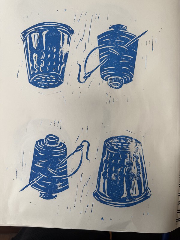

I need to revisit both how I press on the linoleum and how I put the ink on. I feel like I’m carving deep enough for blank spaces based on what I’ve seen other people do, but I’m still getting random lines. Sometimes that’s cool and I like it as an artifact. Sometimes it makes me unhappy. I’d like to be able to have more control over it.


I’m also working back through some of the photos from the trip to Montana. These are just sketches to see what kind of depth I might have in drawings or prints. It’s a fun way to revisit some of the photos.


The buffalo linocut will be cool. I like the “crooked but interesting” tagline—one for our epoch for sure. But the greatest question for me is why you are using Valvoline motor oil as a paperweight 🙂
You never heard of cooking oil?
Why are you fucking with me?