African-American photos from 1900-1975
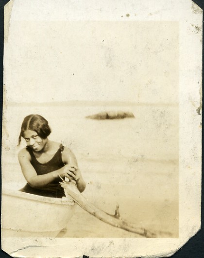
Over at Square America, Nicholas Osborn has posted 150 portraits and photos featuring African Americans. An absolutely beautiful collection.
via BoingBoing
Related posts
Modernist Posters
When it rains, it pours snows people panic and Richmond shuts down. Also when I find one good thing on the Internet, others often show up. So here are minimalist TV show posters by Albert Exergian. I’d do this for sure. It’s another in the line of restriction = creativity possibilities. The drawing skills are really low. It’s all about figuring out the essence of the novel/era/historical person and figuring out how to represent it as simply as possible. You’d have to stress what makes things modernist and really get students thinking about using color, shape etc. with as much thought as possible. The example would be key, as would your explanation of it. I ended up with this from one of the few email newsletters I find worth subscribing to – Very Short List. If you like this type of thing, it’s worth checking out.
- Author: Tom Woodward
- Category: 21st Century Skills, Creative Communication
- Tags: Art, creativity, Design, English, History
Random Media
Stuff I’d like to use in class. 25 Word stories – slightly longer than some earlier examples of text restriction but good stuff none the less. “Houston, We Have a Problem,” by J. Matthew Zoss. I’m sorry, but there’s not enough air in here for everyone. I’ll tell them you were a hero. from Hint Fiction The NY Times terrorism euphemism generator – English teachers could have a lot of fun with this one as well. Explaining the Internet to a street urchin flowchart – so many things to explain to so many different audiences. Tin man logo
- Author: Tom Woodward
- Tags: Art, English, History
Meet the World – Information and Graphics
Grand Reportagem magazine (can’t find a link- it’s from Portugal) has an interesting series of info graphics (you can see them here) that illustrating fairly disturbing facts about countries- using the flags of the countries. Interesting idea- using symbols of pride to criticize/inform. You could also do something similar with many logos (companies, sports, universities). If you wanted to go fairly abstract there’s also book/video/cd covers or even caricatures. Here a quick mock up with an old Apple logo- Stat Source – please excuse gross visual misrepresentation of the stats but I don’t have the time/willingness to actually work it out. This would make a really interesting co-curricular project between a math and history/sociology type of class (throw in art as well if you’d like). The math required to calculate the proper area to factually represent the statistics would be fairly decent (especially with more complex shapes and area calculations) and figuring out which statistics about the country/company/person to contrast would require quite a bit of research and processing. I think it’s hook a number of students and in the end you’re teaching them far more than stats or facts. You’re teaching them how to think and how to convey that thinking in a way that’s visually compelling. All the great ideas in the world mean nothing if you can’t […]
- Author: Tom Woodward
- Category: Creative Communication, Data, Data Visualization, Possibilities
- Tags: Art, History, Projects