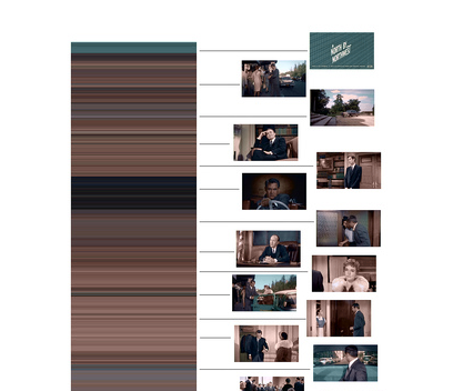
Just yesterday Jim retweeted Psychmedia‘s find. Essentially, this post shows the first 1000 frames of North by Northwest by average color.

Games you could play with these kind of data images1
- Give someone the image. They tell the story based on the colors. The key here would be to map the writing to the image bands in a way that keeps it contextual. It also be nice to be able to stack columns of different interpretations out horizontally to see the different interpretations of the same bands.
- Take three movies and break them down this way. How do the colors compare? Why do you think that’s the case? You could break down three movies from the same director and look for matches or just do it randomly.
- Just doing this kind of analyzation and mapping to the actual stills would be a pretty intense assignment if you talked about whether the average color was representative of the scene/plot. Do dark colors always match
- It would also be wild to produce your own movie with this kind of color breakdown in mind. If you knew people would see this, what color choices might you make? I’d try to send odd codes or make the average colors very misleading.
I love this sort of odd data display for common items. It reminds me of the really wild text arc stuff. I love that potential to look at things in odd ways. Even if it doesn’t end up making sense (Dan’s toast brightness values), I think you gain something in the pursuit.
1 It’s worth noting that you could do all of this in an English classroom and get at some really serious analysis. You could even reverse things and have students create the color graph for a novel. What would those colors be in the movie? Explain your choices.