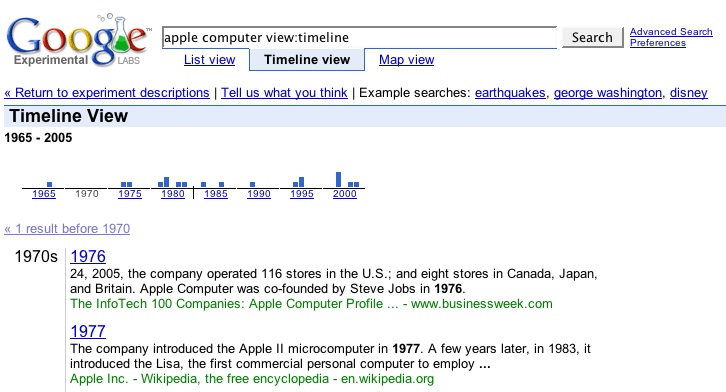
A really amazing looking tool from Google with some interesting educational potential. It’s worth checking out. Found via Digg. […]
Google Timeline
A really amazing looking tool from Google with some interesting educational potential. It’s worth checking out. Found via Digg. […]

U.S. Housing Prices The first example is an animated roller coaster ride of US home costs adjusted for inflation. It’s a pretty dramatic and entertaining way to look at the data (link from Digg). It makes a graph “real” in a way that I’ve never really seen before. Personal Pies Personal Pies (great title) is […]