OK, the new1 Exhibit API is crazy fast. It still takes a second or so to load but once it’s up and running the selection speed is dramatically improved. DRAMATICALLY2. I’ve been pitching the Simile project3, especially Exhibit, for quite a while for all sorts of educational uses. It really is fairly simple and allows […]
Category: Data
Why I loathe Portaportal

The following is an attack on an idea and a structure. I am in no way trying to attack you if you use Portaportal but I would like to change your mind. I encourage you blasting back in the comments but if you call me names, I’ll likely cry. Sure, I get a lot of […]
TED Spreadsheet Exhibit Remix
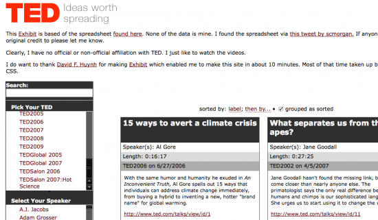
This Exhibit is based of the spreadsheet found here. None of the data is mine. I found the spreadsheet via this tweet by scmorgan. If anyone knows who to give original credit to please let me know1 Clearly, I have no official or non-official affiliation with TED. I just like to watch the videos. I […]
The Future of Search
It has been interesting to see the excitement surrounding WolframAlpha . The new “Computational Knowledge Engine” called Wolfram|Alpha has gone through a full media cycle before it has even been unleashed on the world. It has been hyped as a “Google Killer” and denounced as snake oil, and we’re still at least a few days […]
Why it’s hard to stay interesting
Even the things that you think are pointing you to new material may be further mainstreaming you. Online merchants such as Amazon, iTunes and Netflix may stock more items than your local book, CD, or video store, but they are no friend to “niche culture”. Internet sharing mechanisms such as YouTube and Google PageRank, which […]
A Little More Wordle and Poetry

Well, you know how I love Exhibit and I’m also a poetry fan. So after messing around with it some the other day and seeing some interest from a few people who put in their own poems- I decided to see what other poems might be on there and see if I couldn’t display them […]
Citizen Data Visualization
How cool is this? Today, we’re taking the next step in reader involvement with the launch of The New York Times Visualization Lab, which allows readers to create compelling interactive charts, graphs, maps and other types of graphical presentations from data made available by Times editors. NYTimes.com readers can comment on the visualizations, share them […]
Teaching the Election – The Internet Way
Here are the things I’d be working into the mix if I were teaching English, government, math/stats or history in this fine political season. Political Bias? Lifehacker pointed out this cool little Greasemonkey script “Memeorandum Colors script colors sites that usually link to conservative topics red, and sites that generally link to liberal topics blue […]
Stats, Math, Data and Sociology

Want some really interesting and topical statistics to use? Of course you do. This is a great site for math, stats, and sociology. Seems like Zubin Jelveh is writing things that’d mix into Dan Meyer’s class pretty well. He’s got everything from Pete Rose’s betting stats to the cost of pennies and the economic ramifications […]
To Clarify Add Detail
I bounced from this O’Reilly post to this Edward Tufte video on the iPhone. It’s a big file but fairly short and worth listening to if just for the last few lines. To clarify add detail. Clutter and overload are not an attribute of information. They are failures of design. If the information is in […]