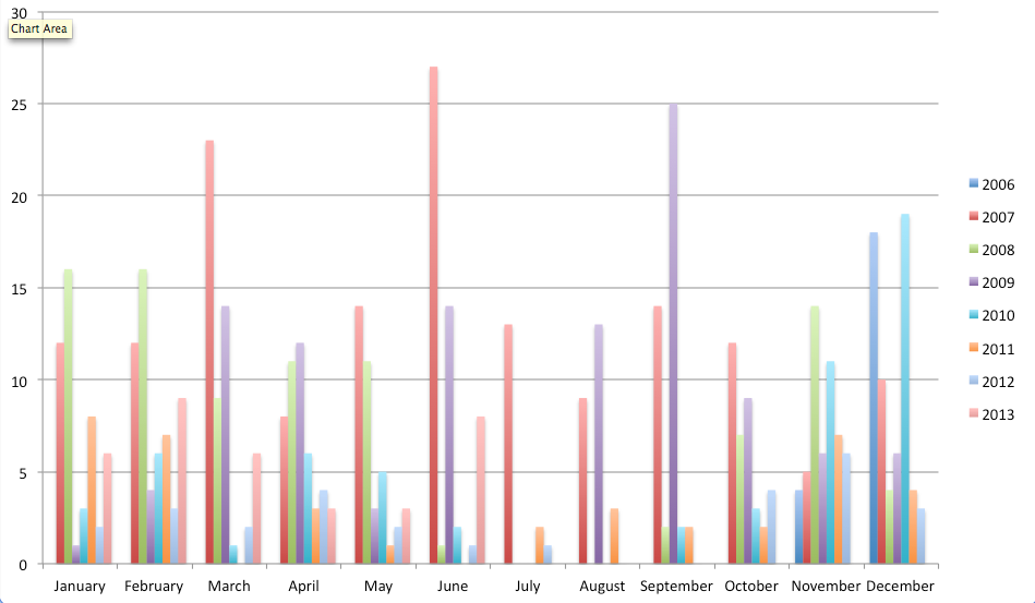
I wondered about my blogging patterns given my recent increase in posts. I didn’t bother pulling out Jim Coe’s posts from back when this was a joint blog but the data is good enough for my purpose. Anyway, I started messing with it and am working towards a visual way to represent it in a way that makes sense to me.

I’m totally unhappy with this graph. Totally. I messed with some color pallets etc. but it just didn’t do what I wanted at all.
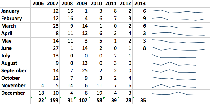
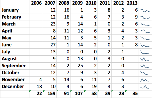
I then went to the opposite end of the spectrum and wanted to see what sparklines might show me. Sparklines are a favorite of Edward Tufte who is on the super minimalist side of the data visualization spectrum.1 At first I didn’t think there was enough data to make the sparklines work. I then tried compressing the horizontal axis and it improved things but it’s still not what I want.

Here’s another stacked year graph that I might work on some more. I ended up wandering into Adobe Illustrator and found out there are some interesting tricks for making graphs in there. I will explore it more in the near future. I’m learning a lot of things.
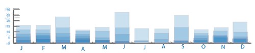
Here’s a messy (deliberately) stack of the graphs above with the opacity set to 20% or so. It gives a modified version of a stacked bar chart that I kind of like. It’s not a complete picture but, coupled with the source graphs, it starting to look like what I want.
1 There’s probably a happier middle ground but he has a number of good points. If you’re in HCPS and interested in checking out some of his books let me know and I’ll bring them in.