I have meant to play around more with the Google Chart API for a while and I wasn’t happy with what I made earlier to visualize the network storage differences among the schools and users. I thought a treemap would be a more powerful way to show just how much space a few teachers used vs the masses. Knowing your options and picking the right one to help illustrate your point is an important element of data visualization. After all, we aren’t ignorant savages who believe –Isn’t this about visualizations, basically a form designed for those who won’t (or can’t) read? Kinda like remedial explanation for the 99%.”
You can see the Google example for this kind of graphic here. This is my first time messing with it so I started by copying their example into my text editor. Their example was pretty close to what I wanted in terms of the structure of the information. They had Location, Parent, Volume, Color as the main variables. I wanted something pretty similar.
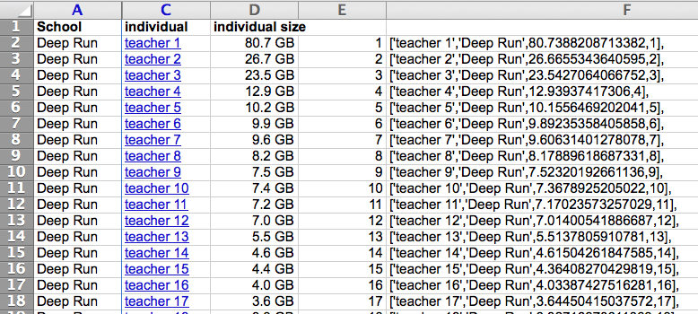
Instead of ‘Global,’ ‘HCPS’ was my top category with the schools taking the place of the countries. Pretty simple but I sure didn’t want to write all that data by hand. I already had the basic data in Excel, I just had to come up with the right formula. In this case –
=”[‘”&C2&”‘,”&”‘”&A2&”‘”&”,”&D2&”,”&E2&”],”
It’s worth remembering how handy Excel is at doing stuff like this. Anything within double quotes is written as is and the rest is just plugging in the cell variables. From there I just needed to cut and paste the column in. Easy and quick.

The only other small I change I made was to the color scale. It was red/green which tends to indicate pretty specific types of judgement. I wasn’t interested in that so I made a small switch there. Changing the minColor/maxColor variables indicated below. They are hexadecimal color values if you’re unfamiliar with them.
minColor: ‘#0033CC‘,
midColor: ‘#ddd’,
maxColor: ‘#fff‘,
headerHeight: 15,
fontColor: ‘black’,
showScale: true});
I’m still not sure about a couple of things. For instance, I can’t figure out why Glen Allen is darker than Tucker and Godwin on the main view. That seems to be similar to what’s going on the example but I’m not sure why. It’d also be nice if clicking on the parent piece after you drill down would take you back up a level. I think that’s doable.
You can see the full size example here if it amuses you. It’s crammed in below using an iframe which will let you put just about anything into an html page. The code used to embed it below is provided as an example.