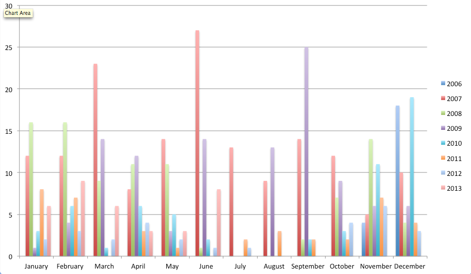
I wondered about my blogging patterns given my recent increase in posts. I didn’t bother pulling out Jim Coe’s posts from back when this was a joint blog but the data is good enough for my purpose. Anyway, I started messing with it and am working towards a visual way to represent it in a […]
Category: Data
More Storage Visualization
I have meant to play around more with the Google Chart API for a while and I wasn’t happy with what I made earlier to visualize the network storage differences among the schools and users. I thought a treemap would be a more powerful way to show just how much space a few teachers used […]
Networked Storage Data
We have 668 high school teachers using at least .1 MB on a shared network volumes we’ve collectively dubbed “Virtual Share.” Those 668 high school teachers use 2019.7 GB or 2.02 terabytes of storage. What’s particularly interesting to me is the disproportionate usage between teachers. The top user, a single person, uses 180 GB or […]
Why I Talk This Way
I spent quite a lot of time with my wife and oldest son looking at the dialectic survey map1 and trying to figure out which one of us said a particular phrase or pronounced a word a certain way. About half the time I answered “all of the above” while my wife was tried and […]
English in the Wild and Mapping Thoughts
Word Games/English in the Wild I made a blog focused on the idea of English in the wild. The goal is to look at language and how it works outside of school, to capture the things people find interesting, odd, or broken about English as they interact with it. Essentially, I keep finding things that […]
Is it a lie?
So I actually taught a 55 minute class Monday. I’d give myself a C- but I think the underlying concept and the examples are decent and worth sharing. Here’s the idea. Essentially it’s easier and easier to tell convincing lies in a digital environment. I’m stealing from Dan Meyer here. I asked the kids to […]
Random Thoughts and Examples of Student Dashboards
This collection of dashboards1 was brought on by a tweet2 from Dan Meyer but precipitated by the fact that I am struggling to figure out what matters in terms of a future LMS and how the data we present (or don’t present) to students and teachers impacts education as a whole.3 While we4 often say […]
Read More… from Random Thoughts and Examples of Student Dashboards
Based on Faulty Information
Their opinions are based on faulty information . I shot this quick clip in one of the classrooms that was doing the performance based assessment. The audio is terrible but what this student says is perfect. It’s actually kind of scary because there are people who don’t do this out in the public- like they […]
8 Bit Excel
Spreadsheet Invasion from Amy Thornley done in Excel. -via Flowingdata Excel is usually a place where people go to suffer1. It is time to reclaim it. Animate a scene using colored Excel cells as your medium. Want some 8 bit inspiration? 8 bit stop motion MW|WM 8 bit music 1 For the record, I actually […]
UMW Faculty Academy 2010 prt.1
cc licensed flickr photo shared by bionicteaching Here are a few of the things I’m thinking about after a great time at Faculty Academy. Raw notes are below. The big picture stuff is pretty simple. Work that is student driven, public and has a real audience results in all kinds of good things happening. We […]