This collection of dashboards1 was brought on by a tweet2 from Dan Meyer but precipitated by the fact that I am struggling to figure out what matters in terms of a future LMS and how the data we present (or don’t present) to students and teachers impacts education as a whole.3
While we4 often say we5 want a balance between multiple choice assessment and other types of assessment, if the only data that teachers see and talk about is related to multiple choice we probably shouldn’t bother talking about other types of assessment. There’s also the idea that assessment data may just be the tip of the iceberg. I’m not sure what exactly would make a difference but there are lots of other things that ought to be looked at.
In the end I see the data displayed to students and teachers as being pretty important but it means nothing if it’s not set within the right context and used in the right way by both parties.
All that aside, let’s see what’s going on right now.
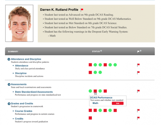
Delaware Insight Dashboards
Fairly traditional, I’m not sure these dashboards are even meant for student view but many of the systems I’ve seen lately just give students access to their own data with the same views they give teachers and call it a student dashboard. One of the things that concerns me here is the green/red binary system. There is no room for even a yellow in this world view? Even if your focus is purely on test scores, this kind of thought disregards the importance of scores that fall immediately below and above the cut score. Those scores can easily go either way so seeing green may lead to unfortunate degrees of over confidence.
EquipSchools
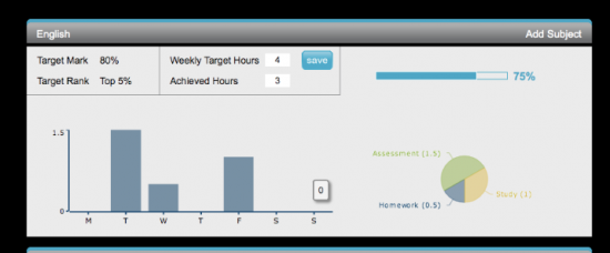
Despite having one of the worst icons I have ever seen, EquipSchools has some interesting pieces to this dashboard.

Note the motivation/stress/energy/engagement/homework chart on the right. I’ve seen some people6 encouraging students to input those kind of data that through Twitter like status updates that use emoticons to indicate the emotional state but this is the first I’ve seen of something more sophisticated. It would be interesting to have those kind of data as a student and as a teacher but it seems like they have an awful lot of categories. I can’t think of a way to gather those data without it being either burdensome (and thus not done) or ineffective. Their method, multiple strand Likert scale ratings, seems to be presented in a way that ties it too loosely with time and too tightly with projects for it to be as useful as it could be.

I like the idea this seems to support. Students ought to set goals and the software ought to facilitate that as well as the tracking of progress towards those goals. While that’s a relatively obvious idea, it’s not often done. Most student data dashboards are purely passive visualizations of test data.7 If you’re lucky you might get a mouse over for more information or a dynamic chart.
Ten Marks
![TenMarks Student Home[5]](http://bionicteaching.com/wp-content/uploads/2012/03/TenMarks-Student-Home51-550x515.jpg)
This is one of those dashboards that seems to creep up too often in education. It tries to make the data fun by letting you fill up these wacky body shapes with blood.8 It’s pretty much useless for student reflection and really only shows progression along a predetermined path.
You can also see some attempts at “gamification” going on in the sidebar. Apparently you can earn presents. This type of thing would prepare your children well to succeed in College Apprentice where they can accomplish feats and win awards by generating points by attending “events hosted and supported by College Apprentice.”
Read 180

Read 180 pulls out all the stops on the “gamification” bandwagon. I almost expect to get some virtual chickens for my virtual farm if I read enough. Personally, I don’t like this mentality. I fear it’s going to catch on and I imagine it motivates certain kids. I don’t think it does anything to help them learn or reflect on what they’re doing that might impact their learning. I don’t think it’s aiming too high to expect that.
1 A pretty imprecise word that appears to mean quite a few different things to different people.
2 I will never like that word.
3 Someplace I have an interesting way that someone was visualizing learning along five thematic branches (content, critical thinking, etc.) and displaying it as a star/pentagram in order to help reflect the idea of balance. For some reason I thought it was an NSF grant but I’m not finding it currently.
4 I have a frog in my pocket.
5 Yep, frog is still there.
6 I think it was eSparks but their website tells you nothing. I’m also pretty sure Dell’s new personalized learning environment does this as well but I can’t recall if they aggregate the results for student reflection.
7 CosmicMath seems to be a good example of that.
8 It’s bright red, apparently liquid, and in a body. What else could it be?


Tom,
I have nothing profound to say, just thanks for doing the leg work on this. I’ll be interested to see what comes of this discussion.
Also, red liquid in body = Kool-Aid.
Luke – Red wine and Jello also came to mind later. No excuse.
I like the writing prompts. Good stuff.
Tom,
Thank you for sharing your thoughts about your research on some tools that are available to help assess student knowledge in unconventional ways. I say unconventional because the norm is still report cards where a letter or a number represents some kind of understanding of knowledge about any number of assessments given in a class which mirror absolutely nothing in another class.
K. So your post about seeing something somewhere that included 21st century skills led me towards searching Google this morning. After spending time with you and your staff this past week I am doubly motivated about how to showcase growth and intrigued by some of the tools you’ve shown here. Some of my research has centered around the work of the very inspiring Dr. Helen Barrett (http://blog.helenbarrett.org/) and tools like Google to create ePortfolios. I do, however, admit that there must be some schools out there that have gone to great lengths to set up a system of portfolio based assessments that has some of what I am trying to do all figured out (or at least in process). Starting from scratch is difficult and the collective power of the many always trumps the knowledge of the few, yes?
So in my quest this morning I came across an interesting measure from the Center for Experiential Learning, Leadership and Technology. Although after much trolling on the Internet I cannot find a student sample! I see that their assessments include lessons having to do with 21st century skills and how to encourage and stimulate the kind of thinking that you and your team have at Henrico. http://www.cellt.org/node/9 Thanks for leading me to some interesting finds today. 🙂
Appreciate you doing all that as well. Gives me a few more things to think about.
Thanks for pulling these together, Tom.
Tom, interesting topic–and I think you’re right in honing in on goal-setting and how we share information on the realization of those goals (as either educator or learner).
I’ll just plug that this is particularly relevant to some of the work that’s being done here at Instructure right now, as our product dev team continues to test and refine useful, intuitive dashboards for our new analytics features. If you’re interested in seeing the latest mock-ups and giving some feedback, let me know.
Oh, and be careful with that frog.
I’d be very interested in seeing those and responding from the k12 perspective. Are you working for Instructure now? I talked to them at CoSN based on UMW’s seeming enjoyment of the system.
Here’s another student dashboard that has some interesting visuals but I’m not sure how they measure what they display.
A non educational example that has some potential in terms of goal setting and infographics.