I bounced from this O’Reilly post to this Edward Tufte video on the iPhone. It’s a big file but fairly short and worth listening to if just for the last few lines. To clarify add detail. Clutter and overload are not an attribute of information. They are failures of design. If the information is in […]
Category: Data
Google Forms to Exhibit Example (POC)
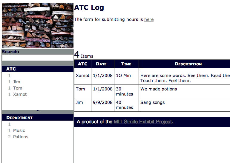
So, I’ve managed to create two quick websites for work that are driven by Google’s new form option for getting data into spreadsheets. I’ve put a quick example of a log here. Feel free to enter data etc. It’s up there to play around with and hopefully is simple enough to help people figure out […]
Just in time tech . . .

Google spreadsheets now lets you share editing by sending out a custom form. This is a huge deal. No, really. Huge. It solves so many problems I see happening all the time in schools. This is such a great way to get large amounts of information from all sorts of people of varying technical skill […]
Actions as a Result of the Annual Report
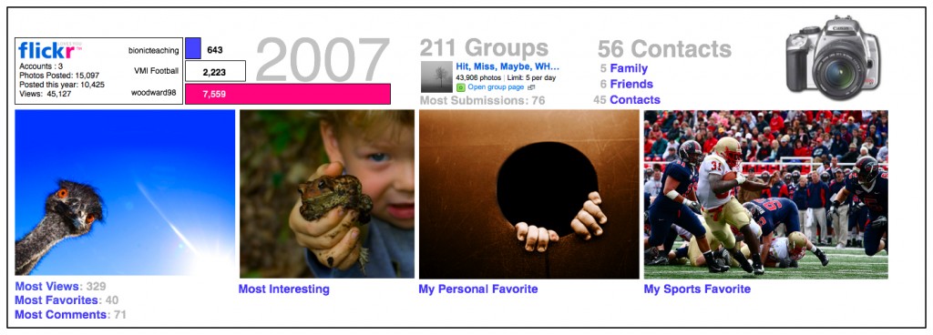
All right. So I didn’t win Dan’s design challenge. Iain’s report and a number of others had both more information and more story than mine. But the contest has led to some more thinking and some action. Feeds All my feeds are now in Google Reader. Now I get stats. That led me to realize […]
Meet the World – Information and Graphics
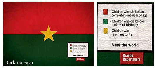
Grand Reportagem magazine (can’t find a link- it’s from Portugal) has an interesting series of info graphics (you can see them here) that illustrating fairly disturbing facts about countries- using the flags of the countries. Interesting idea- using symbols of pride to criticize/inform. You could also do something similar with many logos (companies, sports, universities). […]
Next Level Video – Asterpix
I love the way in some videos you can click on images or text on the screen and they are interactive- taking you to URLs or different portions of the video. I really feel that in education, and elsewhere, this has amazing potential. Making text interactive through hyperlinks changed the world so doing the same […]
Wikipedia Mindmap – more data visualization!
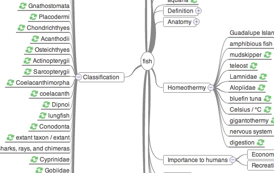
Wiki Mind Map.org This is a really cool free site that’d be great to use in the classroom. You pick a topic from wikipedia and it creates an interactive mind map of the content. Click on the pluses and topics expand. You can even change the “center” topic of the map on the fly. Lots […]
Read More… from Wikipedia Mindmap – more data visualization!
Exhibit and Data Visualization
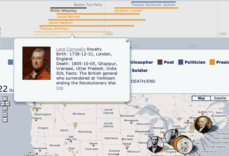
The kind and brilliant folks at MIT have come out with a new Exhibit API that allows for more flexibility and power. The bonus is that it looks good doing it. I’ve now revised my Google spreadsheet fed history example to use some of the new power. It’s here if you’re interested. In the end […]
Google Earth – The Next Level

I found this KMZ file the other night. It’s really the greatest Google Earth file I’ve ever seen. It’s tracking bird flu but it’s doing it through, time, space and evolution. It creates a three dimensional representation of the changing aspects of the virus as it moves from carrier to carrier and place to place. […]
Flags and Pie Charts
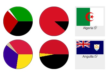
This might be the visual link some students need to start seeing how pie charts reflect real data and it’s not a bad way to get some exposure to the flags of other nations. Basically, the pie chart is shown with the proportional slices for the colors of the flag. You click on the pie […]