In the same vein as my last post,1 WordPress lets you set up courses just about any way you might want. There are some typical patterns people use but there are also a variety of other options that fit individual needs or just make people happy. I’ve done quite a few different scenarios over the last three years so I figured I’d highlight a few structures and some of the things that make them what they are. The sites in general may or may not also have face-to-face components but I’m choosing examples that are more involved than simple syndication sites (aka mother blogs) or sites that focus on particular projects/assignments.
Hopefully these examples show the variation faculty have in terms of what they want and in terms of the flexibility that WordPress can provide.
In this case, I do believe I’ll be able to move from simplest to more complex/customized.
Simple End of the Spectrum
These examples mainly organize and display content and aren’t focused on interaction or student publishing. Usually sites like these predominantly use pages and may not use posts at all. They may also turn off comments to simplify management. The page construction fits neatly within more traditional models of web design.
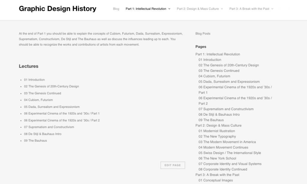
Graphic Design History
The goal here was to put up a bunch of sequential videos in the quickest way possible. There was a desire for a minimalist theme and some control over fonts.
The content was in three main sections, those sections were set as parent pages. Each parent page had a number of child-pages with a single video on each. This enabled us to build the layout and navigation in about ten minutes or so. We used the page list plugin to automatically list the child pages on each parent page using the shortcode. This is a handy plugin for anyone2 who likes to do their organization via pages rather than through posts/categories/tags.
![]()
ICA Museum Course
Another very simple site in many ways. This is just a super-long page with all kinds of multimedia. The theme was adjusted a good bit to resemble the ICA museum page but all those adjustments were done via custom CSS on an existing theme. This was something we did within an hour or so based on a drop-in visit.
The screenshot looks super-odd because the page is so long but the course was an intercession course and was meant to be experience in a much more intense way with students spending numerous hours over a few days rather than a few hours spread over a longer semester.
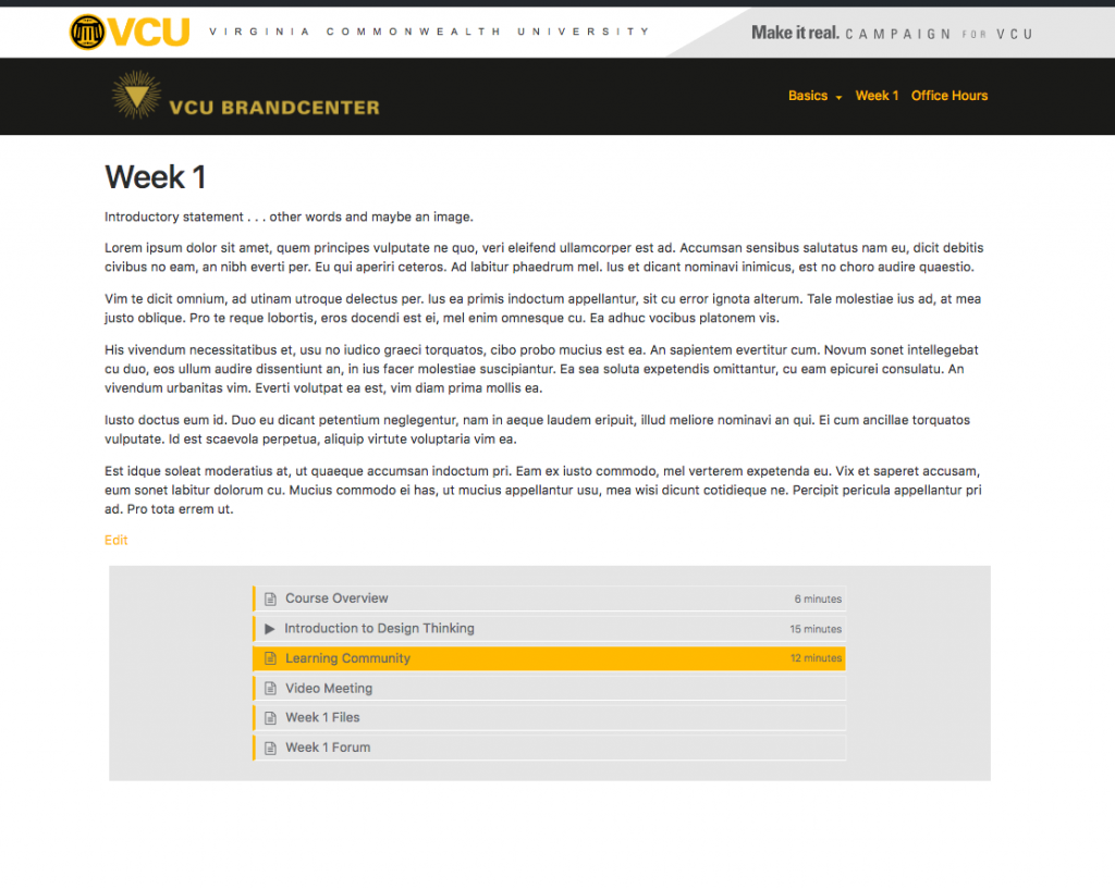
Brand Center Demo
Here we have a custom theme that uses the same page-based-parent/child relationship for content but adds a bit of visual polish. I’m still working on it but it has a custom page template called ‘week’ that automatically adds the children (or siblings) to the bottom of the post and allows you to categorize them via a custom field so they’ll have an appropriate icon and time. Not super fancy but an elevated level of design.
Interactions and Increasing Complexities
These examples are a bit more involved in various ways and start to allow for student interaction in various forms. These sites will have elements of interaction and often use posts with tags/categories as a way to organize content. This is a step away from the more traditional page-based model.
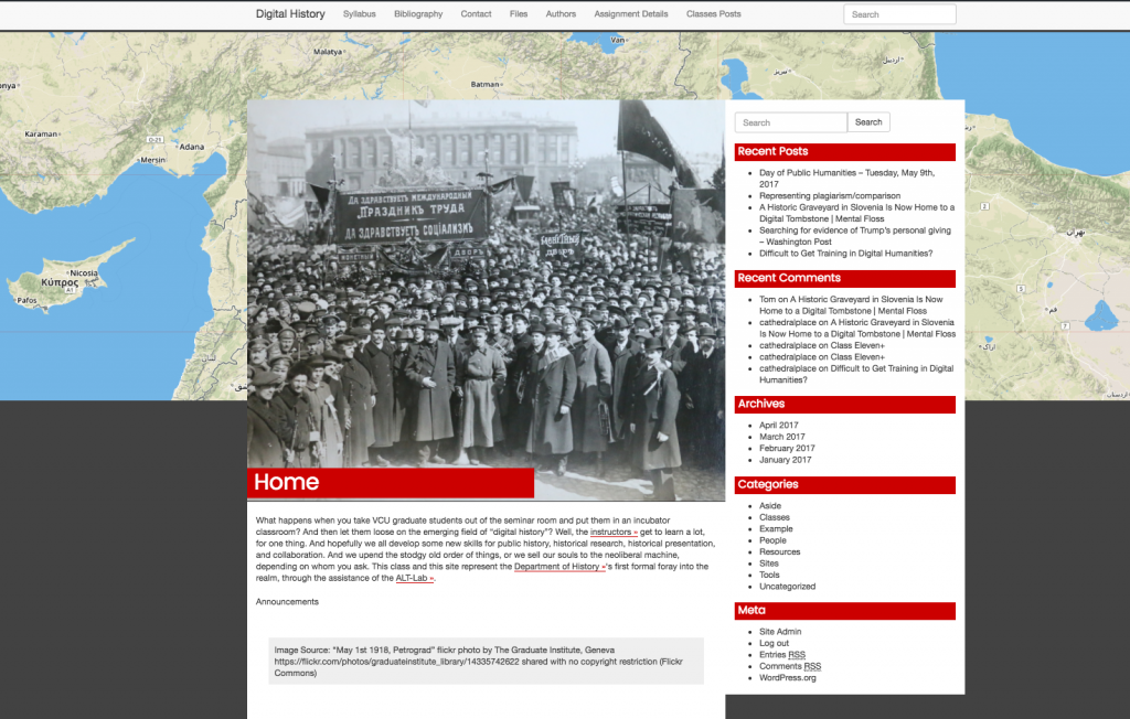
Digital History
This was a super quick construction for a course I’m co-teaching with Ryan Smith from your history department. It has a pretty typical menu of pages at the top. There are little details which make it more interesting –
- the syllabus is an embedded Google Docs so any changes end up published and replicated at the site without additional effort/action
- The files are an embedded Google Drive folder so we’d be able to share some items that are under copyright and still manage them through Google for convenience
- Each class has an associated post which has what I think of as an interesting visual and structured content
- there is some decent commenting going on (keep in mind it’s a very small class)
- the ‘press this’ bookmarklet is used to add content
- the map background generates on each load to display random map coordinates3

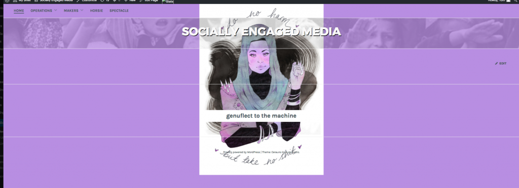
Socially Engaged Media
This course was built with Bob Paris from VCU’s School of Art. I am never quite sure what the site will look like as he takes advantage of the ability to change background colors, headers, and background images to create some pretty unique combinations.
- Language – Bob has given a lot of consideration to the language he uses in his class and the site reflects this. He doesn’t give assignments. He gives operations.
You don’t log into the site, you ‘genuflect to the machine.’4 I believe choices like this matter. They add up to build an experience that is different, that is fully considered. - Students are authors on the site rather than syndicating and the site itself is built like an art gallery. We did a version that was syndicated but the issues in content display between the student theme and the destination led to issues. Since that matters quite a bit in this scenario, we opted to bring the students into one site and build there.
- This site is customized but changes were accomplished through the custom CSS option and a plugin. The Post Grid plugin that Mark built displays the posts from designated categories in a masonry layout on their respective pages.
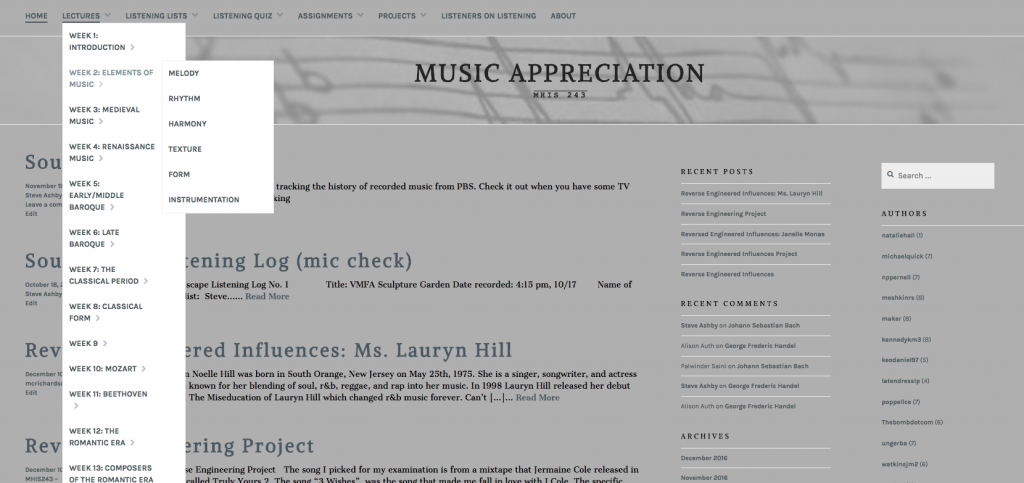
Music Appreciation
This site is pretty comprehensive and makes use of a number of elements. You can see from the menu structure that Steve Ashby has the content divided into weeks with multiple elements per week. The direct instruction content mixes video, text, and uses Spotify playlists.
Student work is syndicated in from their sites via Feed WordPress and categorized so all the content can be seen specific to the individual project. The professor is also using Gravity Forms to do some listening quizzes. Google Docs makes an appearance for some directions.
Finally, there’s a whole series of “Listeners on Listening” interviews and audio recordings that are created as ancillary content by the professor.
All in all, quite a lot going on and it continues to grow in interesting ways.
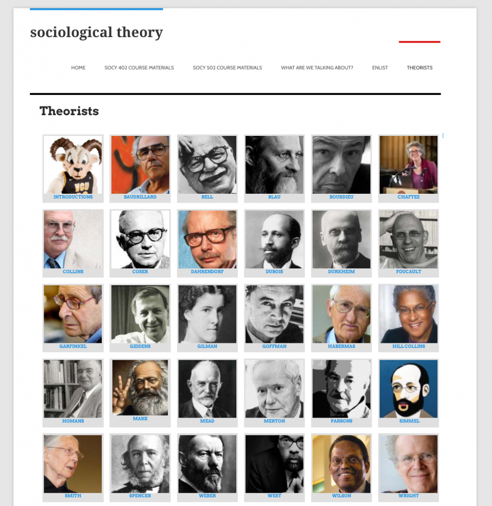
Sociological Theory
This is an older course and one I’ve talked about before but I still like the construction being oriented topically (the theorists themselves) rather than by time and the aggregation of student content between an undergraduate and graduate level course covering similar material. Student content is aggregated via FeedWordPress. Jennifer Jones also has some tag-cloud-ish action going on here and we made a number of efforts to better indicate where comments were occuring in the student sites. Basic syllabus information is included via PDFs. We managed enrollment at this time via a Gravity Form and then did some manual work. I’d use our motherblog plugin were I doing it now.
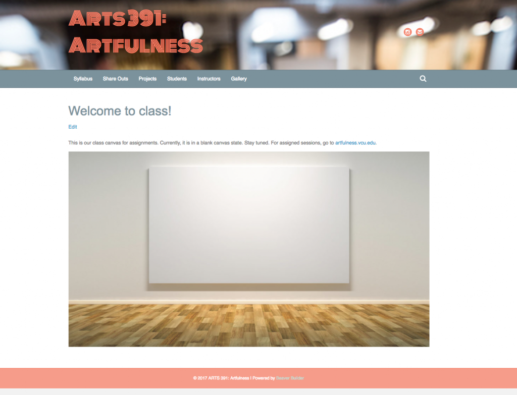
Artfulness – The Course
In addition to the big Artfulness site (which does a number of neat tricks- one of which is documented here) Molly is also teaching a course with students this semester.
We opted to keep students on the front end of the site and have them submit work via Gravity Forms. I managed to keep one form for submissions tied to different categories by using the field_values=”cat=14″ to auto-assign the category without creating an entirely new form. This is handy for when you really don’t care if students are thinking about categories and you just want the stuff to end up in the right place. This pattern works well for relatively simple content- single images, limited text formatting, etc.
For more sophisticated projects later on Gravity Forms didn’t really do what we needed. For these projects we moved to USP Pro which allowed for full editor capabilities on the front end of the site but which also allowed us to set specific categories without student interaction. The students ended up submitting some really interesting gifs and other material which became posts and are displayed categorically and in larger galleries as well.