
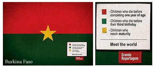
Grand Reportagem magazine (can’t find a link- it’s from Portugal) has an interesting series of info graphics (you can see them here) that illustrating fairly disturbing facts about countries- using the flags of the countries. Interesting idea- using symbols of pride to criticize/inform.
You could also do something similar with many logos (companies, sports, universities). If you wanted to go fairly abstract there’s also book/video/cd covers or even caricatures.
Here a quick mock up with an old Apple logo-

Stat Source – please excuse gross visual misrepresentation of the stats but I don’t have the time/willingness to actually work it out.
This would make a really interesting co-curricular project between a math and history/sociology type of class (throw in art as well if you’d like). The math required to calculate the proper area to factually represent the statistics would be fairly decent (especially with more complex shapes and area calculations) and figuring out which statistics about the country/company/person to contrast would require quite a bit of research and processing.
I think it’s hook a number of students and in the end you’re teaching them far more than stats or facts. You’re teaching them how to think and how to convey that thinking in a way that’s visually compelling. All the great ideas in the world mean nothing if you can’t get them across in a way that is compelling to your audience.

Been meaning to say thanks for posting these–this is a really good example of great information graphics.