I’m working with Greg Pask to make a lab website. When I asked him for some visual inspiration he sent me two comic book covers by David Aja. That was a first! It’s driving me to do some interesting things in Illustrator for the first time. I’ve long promised myself I’d learn vector drawing but haven’t ever actually done it. I’ve mainly just used Keynote’s vector drawing tool.1 I’m jotting down how to do a few of these things as posts so I’ll have a reference and hopefully so it’ll stick in my head better.
Inspiration
I like to work in references to the work the lab does in a variety of ways when I can. Since we’re pushing for a more aggressive visual design for this site, I’m using the limited colors Aja uses (mainly red, black, and white). I saw some graphs from Greg’s research on ant scent processing and I wondered if I could use that jagged line as way to move from a section with a black background to a section with a white background.
Some Attempts
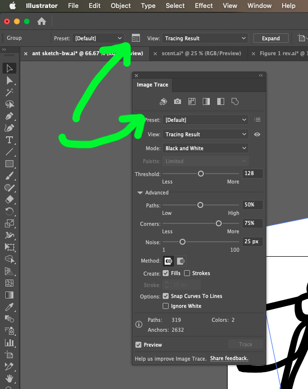 Initially, I found the largest image I could and took a screenshot of the graph. I put it in Illustrator and did Object > Image Trace > Make. Illustrator still feels like a maze of different visual panels. In the screenshot, I’m reminding myself how to get the Image Trace options panel to popup. Eventually I got a tracing that wasn’t terrible.

Now, if you set that at the top of the white div, you get something like this CodePen example. Not at all what I want.
See the Pen
bad transition by Tom (@twwoodward)
on CodePen.
Then I decide I’ll put a black background bar on the upper portion of the graph. You can see that in example two on the Codepen if you scroll down. That was much closer and I left it that way for a while. It kind of looked like dripping ink but, if you knew the data, you might recognize it.
Final Version
2
This morning Greg sent along Illustrator files with the images from his research. Now I had the originals and didn’t have to trace the graphs. That led to some re-thinking. I realized that the graph felt flat because the peaks going into the black all end up flat. I wanted to get more of that blending going on with the image. I tried a bunch of object union variations but nothing ended up working the way I wanted. I was puzzled by some of the results.
Eventually, I found this tutorial3 about using a path to cut an object. The key is to select just the path and place it on top of the object you want to cut. Then choose Object > Divide Objects Below. Don’t select both objects or it won’t work. Now I could draw a black rectangle, put the graph over the top of it and cut it as it intersects the graph. I threw away the bottom portion and exported my new upper portion. That gives me the visual I want and you can see the difference in the third Codepen section.
I was lazy and these examples are using PNGs. For the actual site, I’m using SVGs but I haven’t set up this blog to allow me to upload SVGs as a file type.
1 Strange but true. Pretend I’m like that guy who drew things in Excel.
2 Probably.
3 The accent is a real bonus.