
I wanted to do a little example for a Gravity Forms workshop series I’m doing with Reclaim Hosting. The goal was to play off the Wonder Twins and their ability to change into various shapes. So I thought it’d be fun to propose a scenario and then have people propose different things for the Twins to turn into in order to defeat the bad guys.
Give the final-ish product a try.
So I’ve got a prompt.
The Wonder Twins are known for assuming different forms to help fight crime. Jayna can transform into any animal and Zan can assume water in any form. For instance in the example above, Jayna turns into an octopus and Zan turns into an ice unicycle. I think they do that to avoid falling asleep but it’s a bit confusing.
Now I wanted to show how we can use Gravity Forms to accept two images and combine them with a third image in a way that feels unified. You can see the example below, the form submitter would pick two images and they show up in the circles. The images I used were just some random pictures from my Flickr account.1
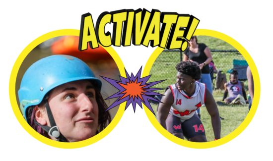
The Overlay
Nothing fancy to this part. I just made an SVG with two transparent holes in it. I am getting better and better at using Illustrator. It only took me 20 years or so to spend the time to do it. It’s never too late kids!

Now the challenge is to put two images in the right places under this overlay image.
Round 1 – Fixed Width, Two Divs
This version makes a big box of specific dimensions – the .holder and uses CSS to put two images as background images for that div. Those images would be whatever the form user submitted. The cover is then positioned over the top to create the unified effect. It’s not bad. I like using CSS to do multiple background images. That’s kind of fun. The hard coded sizes are garbage though and while the example works well with these images other aspect ratios weren’t great.
<div class="holder">
  <div class="cover"></div>
</div>
.holder {
  width: 500px;
  height: 330px;
  postion:relative;
  background-image: url(https://live.staticflickr.com/65535/52042161286_7302217910_w.jpg), url(https://live.staticflickr.com/65535/51679940508_3995b41da8_w.jpg);
  background-position: right top, left top;
  background-repeat: no-repeat, no-repeat;
}

.cover {
  width: 100%;
  height: 100%;
  background-image: url(https://formofawesome.com/wp-content/themes/form-of-awesome/imgs/cover.svg);
  background-position: center;
  background-size: cover;
  background-repeat: no-repeat;
  opacity: 1;
}
Round 2 – Fixed Width, Four Divs
This version did a better job with the size and position of the two form-submitted images. The background-size: cover piece handles that nicely. It’s still stuck in fixed width land though and it just feels like it could be neater.
<div class="other-holder">
  <div class="left-side"></div>
  <div class="right-side"></div>
  <div class="new-cover"></div>
</div>
.other-holder{
   width: 500px;
  height: 330px;
  position:relative;

}

.left-side {
   background-image: url(https://live.staticflickr.com/65535/52042161286_7302217910_w.jpg);
  position: absolute;
  left: 0;
  top: 0;
  width: 50%;
  height: 100%;
  background-size:cover;
}

.right-side {
   background-image: url(https://live.staticflickr.com/65535/51679940508_3995b41da8_w.jpg);
  position: absolute;
  right: 0;
  top: 0;
  width: 50%;
  height: 100%;
  background-size: cover;
}

.new-cover {
     background-image: url(https://formofawesome.com/wp-content/themes/form-of-awesome/imgs/cover.svg);
  position: absolute;
  left:0;
  top:0;
  width: 100%;
  height: 100%;
  z-index: 11;
   background-position: center;
  background-size: cover;
  background-repeat: no-repeat;
}
Round Three – Fluid, One Div
I ended up using this one but it may be because I find it clever more than anything else. I only have one div and we’re stacking three background images in there. Note the serial positioning used to control the three images independently for background-position, background-repeat, and background-size. Perhaps counterintuitively, the first image in the background-image list will be the top image.
.one-holder{
  padding-top: 65%;
  width: 100%;
  height: 100%;
  position:relative;
  background-image:
 url(https://formofawesome.com/wp-content/themes/form-of-awesome/imgs/cover.svg),  url(https://live.staticflickr.com/65535/52042161286_7302217910_w.jpg), url(https://live.staticflickr.com/65535/51679940508_3995b41da8_w.jpg);
  background-position: right top, right top, left top;
  background-repeat: no-repeat,  no-repeat, no-repeat;
  background-size: cover, 50%, 50%;
}
Here are all the examples and I’ll probably keep adding to them.
See the Pen
overlay examples by Tom (@twwoodward)
on CodePen.
The Form Side
Now I need to integrate the form elements into a post created by the submission.
Since the top image will always be the same, I can hardcode it in. The other two images are inserted via the form submission. With a bit of inline CSS and Gravity Forms’ templating variables, we get what we were looking for.
<div class="one-holder" style="background-image: url(https://formofawesome.com/wp-content/themes/form-of-awesome/imgs/cover.svg),url({Upload an image representing Zan's form.:1}),url({Upload an image representing Jayna's form.:3});"></div>
Give the final-ish product a try.
Wrap Up
This is just a silly example and one that could be made far more robust but it starts to show some of the possibilities.
1 I blog and use Flickr. If you’re looking for me, you can find me in the early 2000s. It’s a better time. I highly recommend it.