Interactive Google Sheets Dashboards

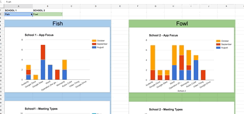
It’s pretty easy to put a bunch of data and charts in a spreadsheet and call it a dashboard. It became a more interesting challenge to make those charts change to reflect variables chosen via dropdown cell menus. The key it turns out is using =query. I can do some really powerful things with query […]

Read More… from Interactive Google Sheets Dashboards

Citizen Data Visualization

How cool is this? Today, we’re taking the next step in reader involvement with the launch of The New York Times Visualization Lab, which allows readers to create compelling interactive charts, graphs, maps and other types of graphical presentations from data made available by Times editors. NYTimes.com readers can comment on the visualizations, share them […]

Read More… from Citizen Data Visualization