How cool is this? Today, we’re taking the next step in reader involvement with the launch of The New York Times Visualization Lab, which allows readers to create compelling interactive charts, graphs, maps and other types of graphical presentations from data made available by Times editors. NYTimes.com readers can comment on the visualizations, share them […]
Tag: Data
Teaching the Election – The Internet Way
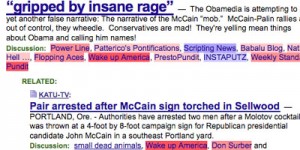
Here are the things I’d be working into the mix if I were teaching English, government, math/stats or history in this fine political season. Political Bias? Lifehacker pointed out this cool little Greasemonkey script “Memeorandum Colors script colors sites that usually link to conservative topics red, and sites that generally link to liberal topics blue […]