One of the things I ended up being dissatisfied with on my own portfolio was the timeline of my work history.1 At the time making an interactive multimedia timeline seemed like a good idea. Just the phrase “interactive multimedia timeline” sounds fancy, right? I made it using the KnightLab Timeline JS tool (which is a great tool) but it just doesn’t do what I want.
Define the Purpose
I hadn’t really thought deeply enough about my audience. If it’s people trying to hire me, and I can’t imagine anyone else caring, then I have to think what I want them to understand at a glance. Paging through the timeline can tell a decent story (if it happens) but the timeline does not allow the viewer to see the big picture at a glance. I also tried to show that while I’ve had a large number of jobs there’s a pattern of, and consistency between, organizations and between higher ed and k12. I tried to make that connection in the Timeline JS version by using the same logo and color pattern in the segments but it requires people to notice that and hold it in their heads. It’s not doing what a good visualization should do which is to offload that cognitive load to the eyes of the viewer.
Hand Sketch
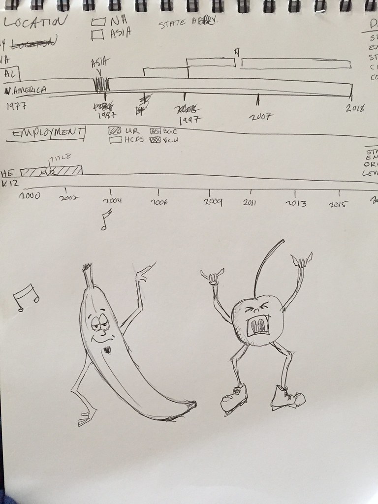
So I opted to sketch out some timeline thoughts. You can see it below. I did it on the same page as I used for my drawing game challenge from the other night.2 You can see two timeline sketches. One is the work history and one depicts where I’ve lived. I often do these sketches to help think. Writing it down just helps force some constraints prior to further thinking it through digitally. On the right edge of the paper you can barely see the start of the data pieces I’ll need to make the display distinctions I’m looking for. For the work timeline it’s pretty simple. I need a start and end date, a job title, an organization, and a level. So five columns if I was making a spreadsheet with as many rows as I have had jobs.
Survey the Field
I’ve seen lots of timelines. I’ve made lots of timelines. I still thought it would be worth looking around for a bit to see what others might have come up with. In addition to some general google searches for timelines,3 I also look like site:bl.ocks.org timeline to restrict the search to just some D3 examples. The nice thing about that site is the code is visible and you gives you a big jump if you opt to use a particular example. The bl.ocks.org site doesn’t have a good built in search so I use that bit of Google advanced search to allow me to search just that site.
I added a number of slightly different or interesting timeline examples to my pinboard bookmarks. That doesn’t mean I like them or dislike them. Often I just like to see how different people approach problems. Navigating large amounts of data is something I run into frequently and I find benefit in seeing examples I like but also in examples I actively dislike.
Digital Sketches
At this point, I start doing digital sketches. Some of those might just be messing with the look using a graphics editor of my choice. Sketch, Keynote, Photoshop, Illustrator, Omnigraffle are all stuff I use depending on my mood and the particular type of illustration I’m trying to make.
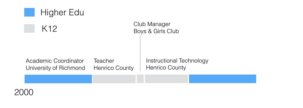
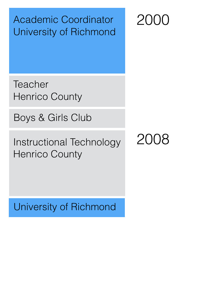
Below are some simple partial sketches using Keynote. I’m just guessing at sizes/percentages but I’m already running into problems with titles being too long. I don’t like the slant option. I could do a vertical alignment but I think people tend to expect horizontal displays for time and I’m losing ‘above the fold’ space that might cost me being able to see the whole timeline in one glance. Although this is a desktop-centric view, I’m guessing most people who want to see this will be on laptops. I will consider phone view constraints but they’re a secondary audience for this particular piece. You can see that despite knowing some of the basic ideas about stripping color when possible, I’m fighting that a bit (and possibly based on research or at least finding some research to back my own beliefs). Inevitably there is the pure science/art of data visualization and there is the practice of it with normal humans. Adding blue doesn’t help understanding but it does make it look better to average viewers.
I also do little programming sketches (bottom of the page) just to get a feel for what writing the code will feel like. I often use CodePen or Web Maker to do that. A CodePen example is included below.
I’m still thinking through exactly how I want this to feel and look…but that’s what the advance work looks like as I start to think it through.
See the Pen google script timeline by Tom (@twwoodward) on CodePen.
One thought on “Portfolio Timeline”
Comments are closed.