How cool is this? Today, we’re taking the next step in reader involvement with the launch of The New York Times Visualization Lab, which allows readers to create compelling interactive charts, graphs, maps and other types of graphical presentations from data made available by Times editors. NYTimes.com readers can comment on the visualizations, share them […]
Category: Data Visualization
Looking at Poetry Through Wordle

I know, late to the party, but I wanted to do a little more than say “Hey, wordle is pretty cool and stuff. You should use it.” So here’s how I’d use Wordle to attack poetry. Take a few poems from the poets you cover, mash a few of the poems together, and create a […]
Teaching the Election – The Internet Way
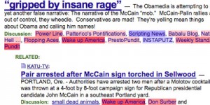
Here are the things I’d be working into the mix if I were teaching English, government, math/stats or history in this fine political season. Political Bias? Lifehacker pointed out this cool little Greasemonkey script “Memeorandum Colors script colors sites that usually link to conservative topics red, and sites that generally link to liberal topics blue […]
Pop Culture and Education Omnibus
A few odd educational goodies from today’s RSS soup. I lay them out here for your dining pleasure. Mental Floss serves up Monte Python clips referencing all sorts of classic literature. References include- Proust, Wordsworth, Shakespeare, Dickens and others. A great way to start of a class or provide a little levity when things are […]
Teaching a Table New Tricks
I’m doing a presentation tomorrow with Jim Groom on how to create mashups without knowing anything about programming. The fun thing is it’s presented using a mashup of communist propaganda posters and that sort of rhetoric. Good clean American fun! It may, or may not, be presented entirely in a fake Russian accent. It will […]
Stats, Math, Data and Sociology

Want some really interesting and topical statistics to use? Of course you do. This is a great site for math, stats, and sociology. Seems like Zubin Jelveh is writing things that’d mix into Dan Meyer’s class pretty well. He’s got everything from Pete Rose’s betting stats to the cost of pennies and the economic ramifications […]
More Humorous/Interesting Info-graphics Based on Songs

brianmn Originally uploaded by boyshapedbox Links to a large set of graphics on flickr based on songs. I didn’t recognize some of the songs but there are lots of fun things to think about. In terms of class use – great art projects, great ways to introduce graphing or diagramming flow charts. Even if you […]
Read More… from More Humorous/Interesting Info-graphics Based on Songs
To Clarify Add Detail
I bounced from this O’Reilly post to this Edward Tufte video on the iPhone. It’s a big file but fairly short and worth listening to if just for the last few lines. To clarify add detail. Clutter and overload are not an attribute of information. They are failures of design. If the information is in […]
Just in time tech . . .

Google spreadsheets now lets you share editing by sending out a custom form. This is a huge deal. No, really. Huge. It solves so many problems I see happening all the time in schools. This is such a great way to get large amounts of information from all sorts of people of varying technical skill […]
State of the Union Address Tag Cloud
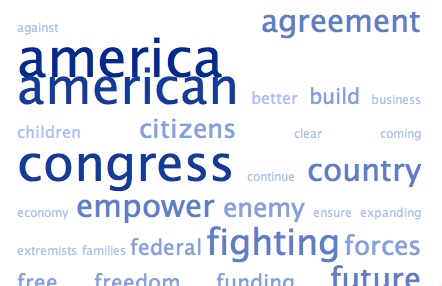
I thought we posted on this last year. Jason Griffey takes The State of the Union address and remixes the top 75 words into a tag cloud. Now that he’s done it two years in a row, it could be an interesting look at the state of affairs over the last two years. 2008 Address […]