First off, I believe that websites that help you think are tools. Websites that help you author media are also tools. So when I say “tools” that’s what I mean. I will also likely call them sites. That’s also what I mean. I like to start off posts like these establishing the fact that I’m […]
Category: Data Visualization
Census Reporter API Exploration
We’re trying out a new site idea for the online digital sociology program. Once again, Matt came up with an idea that really got me excited and I started wandering around trying to figure out how to make it work. At some point I found CensusReporter.org. This is a pretty amazing site that is a […]
Timeline Sketch #2
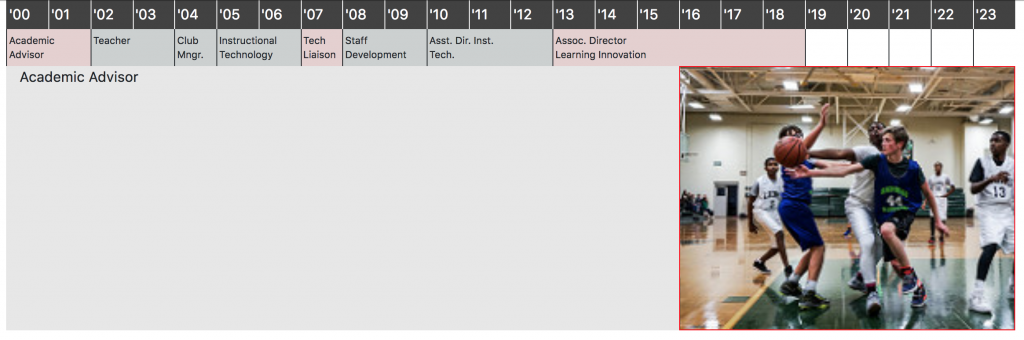
I am still kicking around ideas for a timeline of my work history. You can see some of the other stuff in this post. This version is a Bootstrap version that I think can end up working pretty well even in a mobile view with a bit more work. You can see it full size […]
Portfolio Timeline

One of the things I ended up being dissatisfied with on my own portfolio was the timeline of my work history.1 At the time making an interactive multimedia timeline seemed like a good idea. Just the phrase “interactive multimedia timeline” sounds fancy, right? I made it using the KnightLab Timeline JS tool (which is a […]
Portfolio // Data Visualization
This is meant to be a general survey of a fairly large swathe of concepts and examples with lots of links for additional specificity. I encourage you to follow links.1 I’ve tried to also mix it with quotes from a variety of designers.2 Those people are also worth exploring and most links will lead you […]
Why I’m Teaching Data Viz for Sociology
I’m teaching a course for VCU’s digital sociology Master’s degree program this semester. One of the things I’ve asked the participants to do is explain why they’re taking this course. I’m hoping that will help me customize what we’re going to do in the course. Since I asked the participants to document why they were […]
Data Viz and Dead Fish
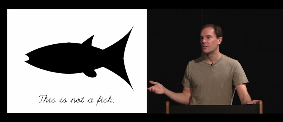
3:40 – “I believe that behavior and responsiveness is the essence of the computer as an art medium and what that means is that any time we create art that doesn’t have behavior we’re not living up to the potential of the medium. It’s not native art.” 4:34 – “… what sort of art is […]
Audio Annotation POC Using WaveSurfer.JS

See the Pen wave surfer – waveform by Tom (@twwoodward) on CodePen. I needed to make a quick proof of concept for the annotation of audio on the web. In this case, it’s meant to provide a visual and auditory way to play through interview segments that represent different categories of responses. I found WaveSurfer.js […]
Simple Text Analysis POC

See the Pen text analysis color viz – step 1 by Tom (@twwoodward) on CodePen. Assuming you have sentences, phrases, or words you’d like to categorize . . . you could do something like this to create a visualization. This one is using CSS but it could be done in any basic word processing software. […]
Using Chart JS in FileMaker Pro 15’s Web Viewer

I’m doing a project in FileMaker. FileMaker 15. I think the last time I used FMP seriously was 2010-ish- version 11 had just come out. It’s still the same program but there have been some interesting changes. It’s also weird now because I have an entirely different set of experiences with technology that I didn’t […]
Read More… from Using Chart JS in FileMaker Pro 15’s Web Viewer